Showing posts with label xy points. Show all posts

Wednesday, May 22, 2013

RG #110: 3D scatter plot with multiple series in Y axis

X = seq(1, 100, 5)
Y = seq (1, 100, 5)
Z = rnorm (length (X), 10, 2)
data1 <- data.frame (X, Y, )
data2 <- data.frame (X, Y, Z1 = Z - 5)
data3 <- data.frame (X, Y, Z1 = Z - 3)


require(scatterplot3d)
s3d <- scatterplot3d(data1, color = "blue", pch = 19, xlim=NULL, ylim=NULL, zlim= c(0, 20))
s3d$points3d(data2, col = "red", pch = 18)
s3d$points3d(data3, col = "green4", pch = 17)


Friday, May 3, 2013

RG#109:small plot(s) with in a big plot

require(ggplot2)
library(gridBase)

plot(cos, -pi, 2*pi, ylim = c(-1.3, 1.5), col = "red")
myd <- data.frame (X = 1:10, Y = c(3, 4, 8, 7, 2, 1, 9, 4, 2, 3))
qp <- qplot(X, Y, data=myd) + theme_bw()

print(qp, vp=viewport(.65, .65, .25, .25))

 library(lattice)
library(gridBase)

plot.new()
pushViewport(viewport())
set.seed(1234)
xvars <- rnorm(25, 5, 1)
yvars <- rnorm(25, 5, 1)
xyplot(yvars~xvars,  xlim = c(0, 10), ylim = c(0, 10) )
pushViewport(viewport(x=.6,y=.85,width=.20,height=.15,just=c("left","top")))
grid.rect()
par(plt = gridPLT(), new=TRUE)
plot(xvars,yvars)
popViewport(2)


Thursday, May 2, 2013

RG#104: 2d density plots


require(ggplot2)

set.seed (1234)
Xv <- c(rnorm (500, 10,3), rnorm (500, 50, 20), rnorm (500, 70, 20))
Yv <- c(rnorm (500, 10,3), rnorm (500, 70, 5), rnorm (500, 30, 5))
myd <- data.frame (Xv, Yv )

m <- ggplot(myd, aes(x = Xv, y = Yv)) +
  geom_point() + geom_density2d() + theme_bw()
  
m


Tuesday, April 30, 2013

RG#96: Basic point and line graph with error bars (publication purpose)


myd <- data.frame (X = c(1:12,1:12),
                   Y = c(8, 12, 13, 18,  22, 16, 24, 29,  34, 15, 8, 6,
                         9, 10, 12, 18, 26, 28, 28, 30, 20, 10, 9, 9),
                   group = rep (c("A-group", "B-group"), each = 12),
                   error = rep (c(2.5, 3.0), each = 12))
                   
require(ggplot2)
require(grid)
# line and point plot
f1 = ggplot(data = myd, aes(x = X, y = Y, group = group) )  # lesion becomes a classifying factor
f2 <- f1 + geom_errorbar(aes(ymin = Y - error, ymax = Y + error), width=0.3) +
geom_line() + geom_point(aes(shape=group, fill=group), size=5)

 f3 <- f2 +  scale_x_continuous("X (units)", breaks=1:12) +
     scale_y_continuous("Y (units)", limits = c(0, 40), breaks=seq(0, 40, by = 5)) +
     scale_shape_manual(values=c(24,21)) +
     scale_fill_manual(values=c("white","black")) +
     stat_abline(intercept=0, slope=0, linetype="dotted") +
     annotate("text", x=11, y=10, label="X") +
     theme_bw()

   optns <- theme (
          plot.title = element_text(face="bold", size=14),
          axis.title.x = element_text(face="bold", size=12),
          axis.title.y = element_text(face="bold", size=12, angle=90),
          panel.grid.major = element_blank(),
          panel.grid.minor = element_blank(),
          legend.position = c(0.2,0.8),
          legend.title = element_blank(),
          legend.text = element_text(size=12),
          legend.key.size = unit(1.5, "lines"),
          legend.key = element_blank()
     )
f3 +  ggtitle ( "MY awsome plot for publication") + optns


Monday, April 29, 2013

RG#95: Interactive Biplot


# data
set.seed(1234)
P <- vector()
DF <- as.data.frame(matrix(rep(NA, 100), nrow=10))
names(DF) <- c(paste("M",1:10, sep=""))
for(i in 1:10) {
DF[,i] <- rnorm(10, 10, 3)
}
rownames (DF) <- paste("O", 1:10, sep = "")

require(BiplotGUI)


Biplots(Data = DF, groups = rep(1, nrow(DF)),PointLabels = rownames(DF),
AxisLabels = colnames(DF))


# you can work in the interactive menu window


Sunday, April 28, 2013

RG#93: Add countour or heat map plot to XY scatter plot

# data
set.seed(1234)
n <- 10000
X = rnorm (n, 10, 4)
Y = X*1.5 + rnorm (n, 0, 8)


## colour brewing
library(RColorBrewer)
g = 11
my.cols <- rev(brewer.pal(g, "RdYlBu"))

#compute 2D kernel density

# kernel density using MASS 
library(MASS)
z <- kde2d(X, Y, n=50)

plot(X, Y, xlab="X", ylab="Y", pch=19, cex=.3, col = "gray60")
contour(z, drawlabels=FALSE, nlevels=g, col=my.cols, add=TRUE, lwd = 2)
abline(h=mean(Y), v=mean(X), lwd=2, col = "black")
legend("topleft", paste("r=", round(cor(X, Y),2)), bty="n")

## estimate the z counts
prob <- c(.99, .95, .90, .8, .5, .1, 0.05)
dx <- diff(z$x[1:2])
dy <- diff(z$y[1:2])
sz <- sort(z$z)

c1 <- cumsum(sz) * dx * dy

levels <- sapply(prob, function(x) {
              approx(c1, sz, xout = 1 - x)$y })

plot(X,Y, col = "gray80", pch = 19, cex = 0.3)
contour(z, levels= round (levels,7), add=T, col = "red")


# smooth scatter
require(KernSmooth)
smoothScatter(X, Y, nrpoints=.3*n, colramp=colorRampPalette(my.cols), pch=19, cex=.3, col = "green1")


Wednesday, April 24, 2013

RG#86: 3D XY plot with sphare plots (interactive)

# data
myd <-data.frame(name =c("A","B","C","D", "E"),
var_x=c(6,7,11,1,8),
var_y=c(9,2,9,4, 2),
var_z=c(4,1,6,5,1),
point_size=c(6,3,6,3, 5)
)
myd$pradius <- myd$point_size*0.15

require(rgl)

spheres3d(myd[,2:4], radius = myd[,6], col = c("darkred", "green", "yellow", "orange", "purple"), alpha = 0.8)
axes3d(box = TRUE)

#title3d(xlab = "var_x", ylab = "var_y", zlab = "var_z")
#text3d(myd[1,2:5], texts = "A")

segs <- rbind(myd[1:2,2:5], myd[2:3,2:5], myd[3:4,2:5], myd[4:5,2:5], myd[c(5,1),2:5])
segments3d(segs, col = "blue", lwd = 2)

# take a SNPshot
rgl.snapshot ("my3dplot.png", fmt = "png")


# you can rotate the axis and take another snapshot, and shave as different name
rgl.snapshot ("my3dplot2.png", fmt = "png")

Tuesday, April 23, 2013

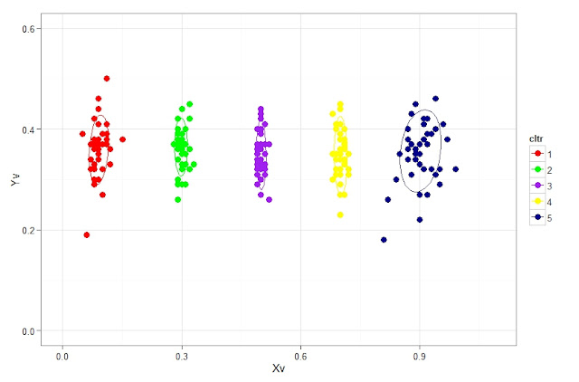
RG#85: Plotting XY plot with cluster and adding ellipse to it


# data 
set.seed (1234)
c1 <- rnorm (40, 0.1, 0.02); c2 <- rnorm (40, 0.3, 0.01)
c3 <- rnorm (40, 0.5, 0.01); c4 <- rnorm (40, 0.7, 0.01)
c5 <- rnorm (40, 0.9, 0.03)
Yv <- 0.3 + rnorm (200, 0.05, 0.05)
myd <- data.frame (Xv = round (c(c1, c2, c3, c4, c5), 2), Yv = round (Yv, 2),
 cltr = factor (rep(1:5, each = 40)))

library(devtools)
require(ggplot2)
source_url("https://raw.github.com/low-decarie/FAAV/master/r/stat-ellipse.R")

ggplot(myd, aes(x=Xv, y=Yv, color=cltr)) + ylim (c(0, 0.1 + max(myd$Yv))) + stat_ellipse() +
xlim (c(0, 0.1 + max(myd$Xv))) +
 geom_point(shape=20, size = 5) +
 scale_colour_manual ( values = c("red", "green", "purple", "yellow", "blue4")) +
 theme_bw()


# plot using base:

plot(myd$Xv, myd$Yv, col = myd$cltr, pch = 19, cex = 1.5)


# interactively identifying the points, use stop when done  
identify (myd$Xv, myd$Yv,labels = row.names(myd))

plot(myd$Xv, myd$Yv, col = myd$cltr, pch = 19, cex = 1.5)


# add points by clicking, use stop when done  
pl <- locator (type = "p", pch = 2, col = "green1")
pl # see the coordinates on added points 

plot(myd$Xv, myd$Yv, col = myd$cltr, pch = 19, cex = 1.5)
# add lines by clicking 
cord <- locator (type = "l", col = "green1", lwd = 2)
cord # display coordinates 


# interactive scatter plot 
require(iplots) 
iplot(myd$Xv, myd$Yv, col = myd$cltr, pch = 19, size = 5, ylim = c(0, 1), xlim = c(0,1))


Thursday, April 18, 2013

RG#81: plotting scatter plot with means and samples (means are connected with line while all samples as scatter plot)

set.seed(1234)
Xv <- data.frame (group = rep(1:10, each = 500),
Y = c(rnorm (500, 20, 5), rnorm (500, 35, 10), rnorm (500, 45, 15),
rnorm (500, 65, 18), rnorm (500, 50,15), rnorm( 500, 30, 10),
rnorm (500, 20, 10), rnorm (500, 20, 10),
rnorm (500, 15, 5), rnorm (500, 10,5)))

 # point plot with transparency in color
 with (Xv, plot(group, Y, pch = "-", cex=1.5, col = rgb(red=0, green=0.5, blue=0.5, alpha=0.25)))

 # calculating mean
out1 <- data.frame (with (Xv,  tapply( Y, factor(group), mean)))
names(out1) <- c("meanY")
out1$grp <- rownames (out1)

# ploting mean connected with lines
points (out1$grp, out1$meanY, type = "b", col = "red", pch = 19)


# Hexbin plot may be useful in situation of large number of data points
set.seed(1234)
Xv <- data.frame (group = rep(1:10, each = 5000),
Y = round (c(rnorm (5000, 20, 5), rnorm (5000, 35, 10), rnorm (5000, 45, 15),
rnorm (5000, 65, 18), rnorm (5000, 50,15), rnorm( 5000, 30, 10),
rnorm (5000, 20, 10), rnorm (5000, 20, 10),
rnorm (5000, 15, 5), rnorm (5000, 10,5)), 0))


   require(ggplot2)
require(hexbin)
plt <- ggplot(Xv,aes(x=group,y=Y)) + stat_binhex() + scale_fill_gradientn(colours=c("yellow","red"),name = "Frequency",na.value=NA) + theme_bw()

 # calculating mean
out1 <- data.frame (with (Xv,  tapply( Y, factor(group), mean)))
names(out1) <- c("meanY")
out1$grp <- as.numeric (rownames (out1))

# ploting mean connected with lines
plt1 <- plt + geom_point (aes(grp, meanY), data = out1, pch = 19, col = "blue", cex = 3)


# connecting with line 
plt1 +  geom_line (aes(grp, meanY), data = out1, col = "green1", lwd = 1)


RG#79: Heatmap with overlayed circle (size and color)


set.seed (78888)
rectheat = sample(c(rnorm (10, 5,1), NA, NA), 150, replace = T)
circlefill =  rectheat*10 + rnorm (length (rectheat), 0, 3)
circlesize = rectheat*1.5 + rnorm (length (rectheat), 0, 3)
myd <- data.frame (rowv = rep (1:10, 15), columnv = rep(1:15, each = 10),
          rectheat, circlesize, circlefill)
          
          
require(ggplot2)
 pl1 <-  ggplot(myd, aes(y = factor(rowv),  x = factor(columnv))) +  geom_tile(aes(fill = rectheat)) +  scale_fill_continuous(low = "blue", high = "green")


  pl1  +      geom_point(aes(colour = circlefill,  size =circlesize))  +    scale_color_gradient(low = "yellow",   high = "red")+     scale_size(range = c(1, 20))+   theme_bw()


Wednesday, April 17, 2013

RG#72: XY plot with heatmap strip at margin


set.seed(1234)
mydata <- data.frame (Xv = rnorm (300, 50, 10), Yv = rnorm (300, 10, 3))
mydata$xcat <- cut (mydata$Xv, 10)
mydata$ycat <- cut (mydata$Yv, 10)


# plot 

require(ggplot2)
require(grid)

#Scatter plot without axis titles
p<-ggplot(mydata, aes(x=Xv, y=Yv)) +    geom_point(shape=19)  +
  theme_bw() 

#tile plot for the x axis
px<-ggplot(mydata,aes(x=xcat,y=1,fill=xcat))+geom_tile()+
  scale_x_discrete(expand=c(0,0))+
  scale_fill_hue(h=c(0,120))+
  scale_y_continuous(expand=c(0,0),breaks=1,labels="10")+
  theme(legend.position="none",
        axis.title=element_blank(),
        axis.text.x=element_blank(),
        axis.ticks.x=element_blank(),
        axis.text.y=element_text(color="white"),
        axis.ticks.y=element_line(color="white"))

#tile plot for the y axis
py<-ggplot(mydata,aes(x=1,y=ycat,fill=ycat))+geom_tile()+
  scale_y_discrete(expand=c(0,0))+
  scale_x_continuous(expand=c(0,0),breaks=1,labels="1")+
  scale_fill_hue(h=c(181,360))+
  theme(legend.position="none",
        axis.title=element_blank(),
        axis.text.y=element_blank(),
        axis.ticks.y=element_blank(),
        axis.text.x=element_text(color="white"),
        axis.ticks.x=element_line(color="white"))

#Define layout for the plots (2 rows, 2 columns)
layt<-grid.layout(nrow=2,ncol=2,heights=c(7/8,1/8),widths=c(1/8,7/8),default.units=c('null','null'))
#View the layout of plots
grid.show.layout(layt)

#Draw plots one by one in their positions
grid.newpage()
pushViewport(viewport(layout=layt))
print(py,vp=viewport(layout.pos.row=1,layout.pos.col=1))
print(p,vp=viewport(layout.pos.row=1,layout.pos.col=2))
print(px,vp=viewport(layout.pos.row=2,layout.pos.col=2))


RG#74: Time series plots (weather data example)


st <- as.Date ("2009-1-1")
en <- as.Date ("2009-12-28")
date1 <- seq(st, en, "1 day")
year <- format(date1, "%Y")
month <- format (date1, "%b")
day <- as.numeric (format(date1, "%d"))

avgtm <- round (rnorm (length(date1), 50,5), 1)
maxtm <- round (avgtm + abs(rnorm (length (avgtm), 0, 5)),1)
mintm <-  round (avgtm - abs(rnorm (length (avgtm), 0, 5)), 1)
rmaxtm <- round (maxtm + abs(rnorm (length (avgtm), 0, 5)), 1)
rmintm <-  round (mintm - abs(rnorm (length (avgtm), 0, 5)), 1)


myd <- data.frame ( year, month, day, avgtm, maxtm, mintm, rmaxtm, rmintm )
myd$date <- as.Date(paste(myd$year, myd$month, myd$day), format='%Y %b %d')

# for weeks lines 
tw = as.numeric (as.Date (seq(st, en, "weeks")), origin = "1970-1-1")

# for month lines 
tm = as.numeric (as.Date (seq(st, en, "months")), origin = "1970-1-1")

# plot

   plot(myd$date, myd$avgtm, type = "l", col = "red", xlab = "Date", ylab = "temperature")
   points(myd$date, myd$maxtm, type = "p", col = "green", xlab = "Date", ylab = "temperature", pch = "+", cex = 0.5)
  points(myd$date, myd$mintm, type = "p", col = "blue", xlab = "Date", ylab = "temperature", pch = "-", cex = 0.75)


  abline(v = tw, lty = 1, col = "gray50", lwd = 1)
   abline(v = tm, lty = 1, col = "blue4", lwd=3)

# plot multiple year single plot

st <- as.Date ("2009-1-1")
en <- as.Date ("2012-12-28")
date1 <- seq(st, en, "7 day")
year <- format(date1, "%Y")
month <- format (date1, "%b")
day <- as.numeric (format(date1, "%d"))

avgtm <- round (rnorm (length(date1), 50,5), 1)
maxtm <- round (avgtm + abs(rnorm (length (avgtm), 0, 5)),1)
mintm <-  round (avgtm - abs(rnorm (length (avgtm), 0, 5)), 1)
rmaxtm <- round (maxtm + abs(rnorm (length (avgtm), 0, 5)), 1)
rmintm <-  round (mintm - abs(rnorm (length (avgtm), 0, 5)), 1)


myd <- data.frame ( year, month, day, avgtm, maxtm, mintm, rmaxtm, rmintm )
myd$date <- as.Date(paste(myd$year, myd$month, myd$day), format='%Y %b %d')

# for weeks lines 
ty = as.numeric (as.Date (seq(st, en, "years")), origin = "1970-1-1")

# for month lines 
tm = as.numeric (as.Date (seq(st, en, "months")), origin = "1970-1-1")

# plot

   plot(myd$date, myd$avgtm, type = "l", col = "red", xlab = "Date", ylab = "temperature")
   points(myd$date, myd$maxtm, type = "p", col = "green", xlab = "Date", ylab = "temperature", pch = "+", cex = 0.5)
  points(myd$date, myd$mintm, type = "p", col = "blue", xlab = "Date", ylab = "temperature", pch = "-", cex = 0.75)

abline(v = tm, lty = 1, col = "gray70", lwd=1)


 abline(v = ty, lty = 1, col = "blue", lwd=4)


Sunday, April 14, 2013

RG#61: Plotting US or World Cities

require(maps)
map("world")
data(world.cities)
# cities with minimum 20,000 population
map.cities(world.cities, country = "", minpop = 20000, maxpop = Inf,
pch = ".", col = "red")


map("world", col = "gray70", fill = TRUE)
data(world.cities)

# now device colors from yvar data category
# brewing color for continious color filling


 library(RColorBrewer)
plotclr <- brewer.pal(7,"YlOrRd")#


# categorize in different class for yvar
world.cities$colrs <- as.numeric(cut(world.cities$pop, c(0, 250000, 500000, 750000, 1000000, 1250000, 1500000,Inf)))

# corresponding legend text
legdtxt <- c("<0.25M", "0.25-0.50M", "0.50-0.75M", "0.75-1M", "1-1.5M", ">1.5M")

 map.cities(world.cities, country = "", minpop = 200000, maxpop = Inf, pch = 19, col = plotclr[world.cities$colrs])
legend("bottomleft", legdtxt, horiz = FALSE, fill = plotclr)


# world map cities pch proportional to population and color 
map("world", col = "lightgreen", fill = TRUE)
 
data (world.cities)
 
library(RColorBrewer)
plotclr <- brewer.pal(7,"YlOrRd")#
# categorize in different class for yvar world.cities$colrs <- as.numeric(cut(world.cities$pop, c(0, 250000, 500000, 750000, 1000000, 1250000, 1500000,Inf)))
# corresponding legend text
legdtxt <- c("<0.25M", "0.25-0.50M", "0.50-0.75M", "0.75-1M", "1-1.5M", ">1.5M")


map.cities(world.cities, country = "", minpop = 100000, maxpop = Inf, pch = 19,
 col =  plotclr[world.cities$colrs], cex = world.cities$colrs *0.5)
 
legend("bottomleft", legdtxt, horiz = FALSE, fill = plotclr)


 # same map in US
 map('usa', fill = TRUE, col = "lightgreen")
 data(us.cities)
  library(RColorBrewer)
  plotclr <- brewer.pal(6,"YlOrBr")## categorize in different class for yvar
  us.cities$colrs <- as.numeric(cut(us.cities$pop, c(0, 50000, 500000, 750000, 1000000, Inf)))
   # corresponding legend text
   legdtxt <- c("<0.05M", "0.05-0.50M", "0.50-0.75M", "0.75-1M",  ">1M")
   map.cities(us.cities, country = "", minpop = 50000, maxpop = Inf, pch = 19,
    col =  plotclr[us.cities$colrs], cex = us.cities$colrs)
 legend("bottomleft", legdtxt, horiz = FALSE, fill = plotclr, cex = 0.6)


Friday, April 12, 2013

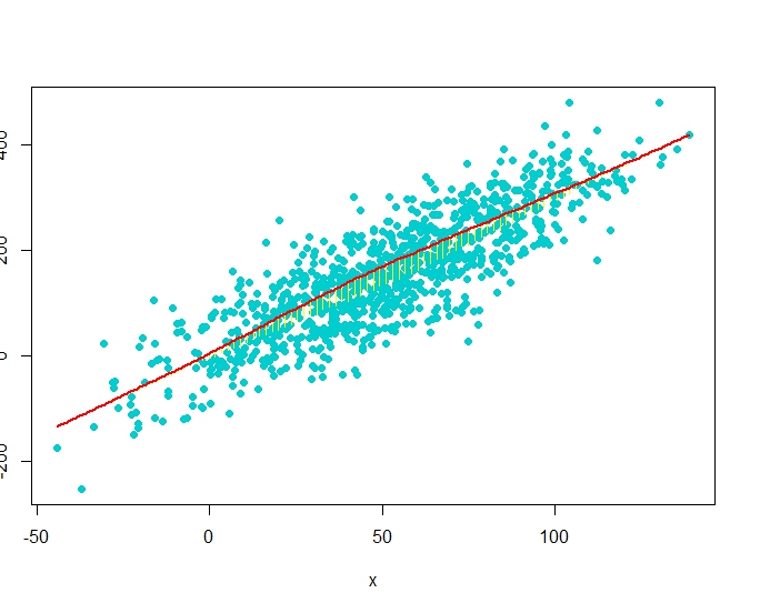
RG#54: Scatter Diagram with Rugs, Spike Histogram, or Density


# data 
set(123)
x <- rnorm(1000, 50, 30)
y <- 3*x + rnorm(1000, 0, 20)
require(Hmisc)

plot(x,y)
#scat1d adds tick marks (bar codes. rug plot) 
# on any of the four sides of an existing plot, 
# corresponding with non-missing values of a vector x.
scat1d(x, col = "red")                 # density bars on top of graph
scat1d(y, 4, col = "blue")              # density bars at right

plot(x,y, pch = 19)
histSpike(x, add=TRUE, col = "green4", lwd = 2)       
histSpike(y, 4, add=TRUE,col = "blue", lwd = 2 )
histSpike(x, type='density',col = "red", add=TRUE)  # smooth density at bottom
histSpike(y, 4, type='density', col = "red", add=TRUE)

plot(x,y, pch = 19)
smooth <- lowess(x, y)    # add nonparametric regression curve
lines(smooth, col = "red")             # Note: plsmo() does this
scat1d(x, y=approx(smooth, xout=x)$y, col = "yellow") # data density on curve
scat1d(x, curve=smooth, col = "yellow")   # same effect as previous command


# data 
set(123)
x <- rnorm(1000, 50, 30)
y <- 3*x + rnorm(1000, 0, 60)
plot(x,y, pch = 19, col = "cyan3")
histSpike(x, curve=smooth, add=TRUE, col = "yellow") # same as previous but with histogram
histSpike(x, curve=smooth, type='density', col = "red",lwd=2, add=TRUE) 


Monday, April 8, 2013

RG#44: Hexabin XY scatter plot and transparent point XY plot


# data
set.seed(1234)
x = rnorm(10000, 50, 30)
y = x*0.6 + rnorm (10000, 0, 30)
df <- data.frame(x,y)


ggplot(df,aes(x=x,y=y)) + stat_binhex() + theme_bw()


# vivid colored 
ggplot(df,aes(x=x,y=y)) + stat_binhex(colour="white",na.rm=TRUE) + scale_fill_gradientn(colours=c("green1","red"),name = "Frequency",na.value=NA)+ theme_bw()


# plot with transparency 

require(ggplot2)
ggplot(df,aes(x=x,y=y)) + geom_point(alpha = 0.3, col = "red") + theme_bw()


# in base

# data
set.seed(1234)
x = rnorm(10000, 50, 30)
y = x*0.6 + rnorm (10000, 0, 30)
df <- data.frame(x,y)


plot(df$x, df$y, pch = 19, cex = 1, col = rgb(0,1,0, alpha = 0.1))


# alpha function to introduce transparency
require(RColorBrewer)

add.alpha <- function(col, alpha=1){
if(missing(col))
stop("vector of colours missing")
apply(sapply(col, col2rgb)/255, 2,
function(x)
rgb(x[1], x[2], x[3], alpha=alpha)) 
}
# POINT SIZE AND TRANSPARENCY
plot (df$x, df$y, pch = 19, cex = 0.5, col = add.alpha ("red", 0.2))


RG#26: Plot of large number of data points (using IDPmisc)

# data 
x <- rnorm(100000, 50, 20)

y <-  x*0.6 + rnorm (100000, 0, 8)
y1 <- runif (100000, 0, 100)

#plot
require(IDPmisc) 
iplot(x, y)
iplot(x, y, pixs=2)


iplot(x = x, y = y1)


RG#37: XY line or scatter plot graph with two Y axis

# data
set.seed(1234)
x <- 1:20
y1 <- rnorm(20, 5, 1)
y2 <- rnorm(20,20, 2)

y3 <- rnorm(20,5, 3)


# plot
par(mar=c(5,4,4,5)+.1)
plot(x,y1,type="l",col="red", ylab = "Y1/Y3")

points (x,y3, col = "green4", pch = 19)

par(new=TRUE)
plot(x, y2, type="l",col="blue",xaxt="n",yaxt="n",xlab="",ylab="")

axis(4)
mtext("y2",side=4,line=3)