Showing posts with label distribution. Show all posts

Tuesday, April 16, 2013

RG#69: Plot binomial distribution


require(ggplot2)
require(grid)

x1  <- 3:17
df <- data.frame(x = x1, y = dbinom(x1, 20, 0.5))

plot1 <- ggplot(df, aes(x = x, y = y)) + geom_bar(stat = "identity", col = "pink", fill = "pink") + 
  scale_y_continuous(expand = c(0.01, 0)) + xlab("x") + ylab("Density") + 
  labs(title = "dbinom(x, 20, 0.5)") + theme_bw(16, "serif") + 
  theme(plot.title = element_text(size = rel(1.2), vjust = 1.5))

print(plot1)


Friday, April 12, 2013

RG#53: Trellis plot in Box-Percentile Panel


set.seed(13)
x <- c(rnorm(1000, 50, 20), rnorm(500, 70, 10), rnorm(500, 30, 10), runif(1000, 0, 100))
g <- rep (c("normal", "binormal", "uniform"), each = 1000)
# default trellis box plot
require(lattice)
#regular box plot  
bwplot(g ~ x, col = "red", fill = c("cyan4", "tan", "blue"))
# box-percentile plot with data density (rug plot) bwplot(g ~ x, panel=panel.bpplot, probs=seq(.01,.49,by=.01), datadensity=TRUE,
col = "red" )


# continuous plot up until quartiles ("Tootsie Roll plot")
bwplot(g ~ x, panel=panel.bpplot, probs=seq(.01,.25,by=.01))

# start at quartiles then make it continuous ("coffin plot")
bwplot(g ~ x, panel=panel.bpplot, probs=seq(.25,.49,by=.01))

# same as previous but add a spike to give 0.95 interval
bwplot(g ~ x, panel=panel.bpplot, probs=c(.025,seq(.25,.49,by=.01)))

# decile plot with reference lines at outer quintiles and median
bwplot(g ~ x, panel=panel.bpplot, probs=c(.1,.2,.3,.4), qref=c(.5,.2,.8))


# prototype of bplot 
bpplt()


LG#52: Box-percentile plots

# data
set.seed(1)
normal <- rnorm(10000, 7.5,3)
binormal <- c(rnorm(5000, 3, 2.5), rnorm(5000, 5, 2.5))
uniform <- runif (10000, -5, 17)

require(Hmisc)
bpplot(normal, binormal, uniform)


Wednesday, April 10, 2013

RG#50: beeswarm box violin plot


# data
set.seed(1234)
bimodal <- c(rnorm(250, -2, 0.6), rnorm(250, 2, 0.6))
uniform <- runif(500, -4, 4)
normal <- rnorm(500, 0, 1.5)
dataf <- data.frame (group = rep(c("bimodal","uniform", "normal"), each = 500), xv = c(bimodal, uniform, normal), cg = rep( c("A","B"), 750))


require(beeswarm)
beeswarm(xv ~ group, data = dataf,method = 'swarm',
pch = 16, pwcol = as.numeric(cg),
xlab = '', ylab = 'xv', labels = c('bimodal', 'uniform', 'normal'))


# center 
beeswarm(xv ~ group, data = dataf,
        method = 'center',
        pch = 16, pwcol = as.numeric(cg),
        xlab = '', ylab = 'xv',
        labels = c('bimodal''uniform', 'normal'))
# hexagon 
beeswarm(xv ~ group, data = dataf,
        method = 'hex',
        pch = 16, pwcol = as.numeric(cg),
        xlab = '', ylab = 'xv',
        labels = c('bimodal''uniform', 'normal'))
# square
dataf$col <- as.numeric(dataf$cg)
dataf$col[dataf$col ==1] = "green4"
dataf$col[dataf$col ==2] = "purple"
beeswarm(xv ~ group, data = dataf,
       method = 'square',
        pch = 16, pwcol = col,
        xlab = '', ylab = 'xv',
        labels = c('bimodal''uniform', 'normal'))


Tuesday, April 9, 2013

RG#48: beanplot


# data 
set.seed(1234)
 bimodal <- c(rnorm(250, -2, 0.6), rnorm(250, 2, 0.6))
uniform <- runif(500, -4, 4)
 normal <- rnorm(500, 0, 1.5)
 ylim <- c(-7, 7)


# plot 
 library("beanplot")
beanplot(bimodal, uniform, normal, ylim = ylim, main = "beanplot",col = c("cyan3", "purple", "purple"), border = "cyan3")
 # col - these colors stand for the area of the beans (without the border, use border for that color), the lines # inside the bean, the lines outside the bean, and the average line per bean


nn

Monday, April 8, 2013

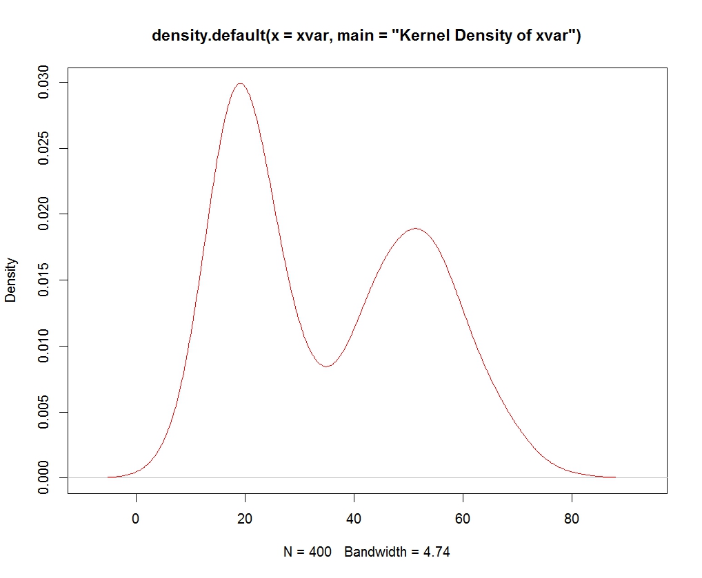
RG#35: density or Kernel density plot

# data
set.seed(1234)
xvar <-  c(rnorm (200, 20, 5), rnorm (200, 50, 10))

# Kernel Density Plot
dnt <- density(xvar, main="Kernel Density of xvar")
plot(dnt, col = "red")


# density area plot
polygon(dnt, col="cyan4", border="red")


Friday, April 5, 2013

RG#12: multiple histograms within a plot

# data
mycol <- c("green ", "blue ", "yellow ")
mydata<- list(rnorm(500, 10,5),rnorm(500, 10, 8),rnorm(500, 15,5) )


# using package plotrix
require(plotrix)
 multhist(mydata, col= mycol)


RG#9: Drawing basic normal curve

# data
# generate 600 numbers in sequence between -4 to 4
x <- seq(-4, 4, length=600)
# calculate normal density
ds <- dnorm(x)


# plot
plot(x, ds, type="l", lty=1, col = 2, xlab="x value", ylab="Density", main="standarized normal distribution curve")


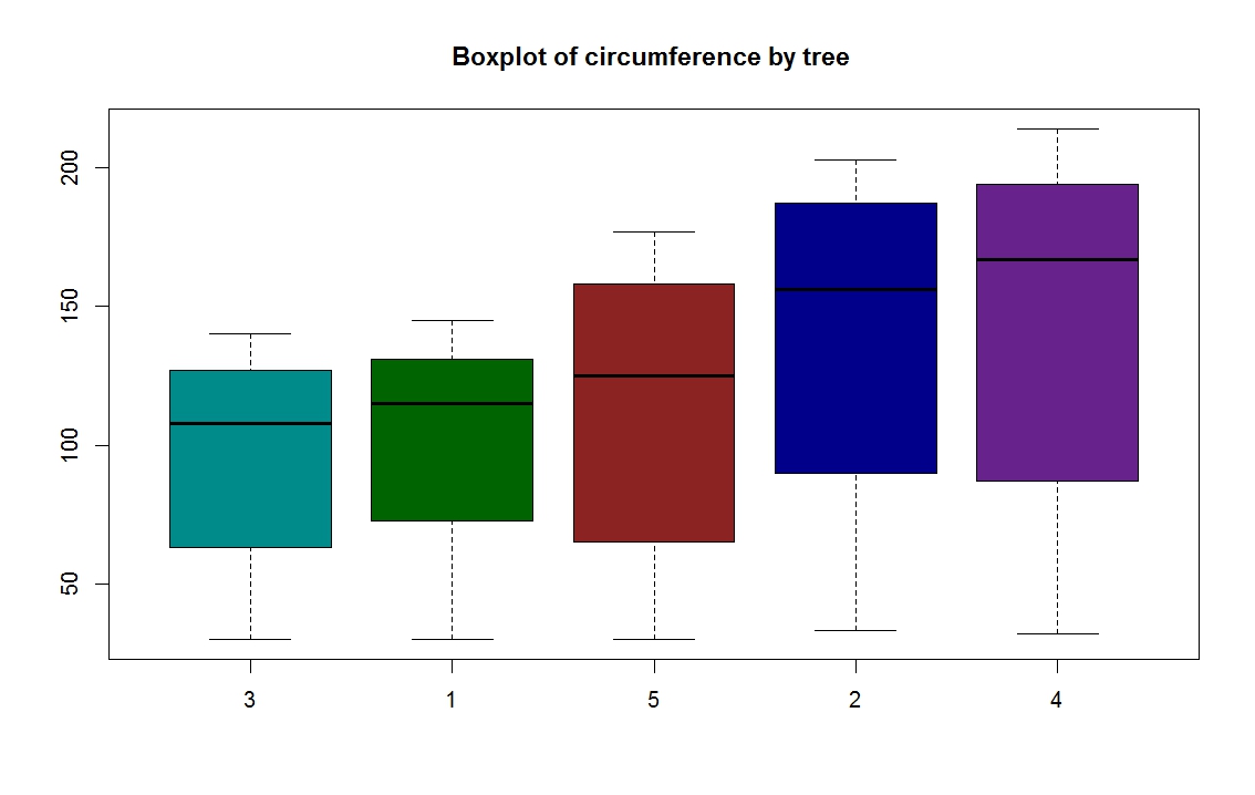
RG # 5: Grouped box plot


# data orage is from R library
data(Orange)

# to summarize the data
summary (Orange)
 Tree       age         circumference 
 3:7   Min.   : 118.0   Min.   : 30.0 
 1:7   1st Qu.: 484.0   1st Qu.: 65.5 
 5:7   Median :1004.0   Median :115.0 
 2:7   Mean   : 922.1   Mean   :115.9 
 4:7   3rd Qu.:1372.0   3rd Qu.:161.5 
       Max.   :1582.0   Max.   :214.0 

# defining own colors, for each group
mycol = c("darkcyan", "darkgreen", "brown4 ", "darkblue", "darkorchid4")
 boxplot(circumference ~ Tree,  data = Orange, main="Boxplot of circumference by tree ", col = mycol)