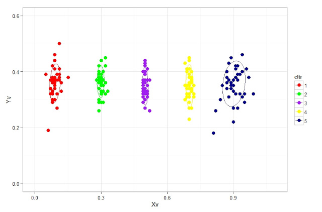
# data
set.seed (1234)
c1 <- rnorm (40, 0.1, 0.02); c2 <- rnorm (40, 0.3, 0.01)
c3 <- rnorm (40, 0.5, 0.01); c4 <- rnorm (40, 0.7, 0.01)
c5 <- rnorm (40, 0.9, 0.03)
Yv <- 0.3 + rnorm (200, 0.05, 0.05)
myd <- data.frame (Xv = round (c(c1, c2, c3, c4, c5), 2), Yv = round (Yv, 2),
cltr = factor (rep(1:5, each = 40)))
library(devtools)
require(ggplot2)
source_url("https://raw.github.com/low-decarie/FAAV/master/r/stat-ellipse.R")
ggplot(myd, aes(x=Xv, y=Yv, color=cltr)) + ylim (c(0, 0.1 + max(myd$Yv))) + stat_ellipse() +
xlim (c(0, 0.1 + max(myd$Xv))) +
geom_point(shape=20, size = 5) +
scale_colour_manual ( values = c("red", "green", "purple", "yellow", "blue4")) +
theme_bw()

# plot using base:
plot(myd$Xv, myd$Yv, col = myd$cltr, pch = 19, cex = 1.5)
# interactively identifying the points, use stop when done
identify (myd$Xv, myd$Yv,labels = row.names(myd))
# add points by clicking, use stop when done
pl <- locator (type = "p", pch = 2, col = "green1")
pl # see the coordinates on added points
plot(myd$Xv, myd$Yv, col = myd$cltr, pch = 19, cex = 1.5)
# add lines by clicking
cord <- locator (type = "l", col = "green1", lwd = 2)
cord # display coordinates # interactive scatter plot
require(iplots)
iplot(myd$Xv, myd$Yv, col = myd$cltr, pch = 19, size = 5, ylim = c(0, 1), xlim = c(0,1))


