# get map
library(ggmap)
# example of map of Dhangadhi, Nepal
dhanmap1 = get_map(location = c(lon = 80.56410278, lat = 28.7089375), zoom = 12, maptype = 'roadmap', source = "google")
dhanmap1 = ggmap(dhanmap1)
dhanmap1
#zoomed map:
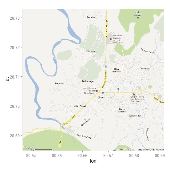
# example of map of Dhangadhi, Nepal
dhanmap2 = get_map(location = c(lon = 80.56410278, lat = 28.7089375), zoom = 14, maptype = 'roadmap', source = "google")
dhanmap2 = ggmap(dhanmap2)
dhanmap2
#zoomed map and satellite type
# example of map of Dhangadhi, Nepal
dhanmap3 = get_map(location = c(lon = 80.56410278, lat = 28.7089375), zoom = 18, maptype = "satellite", source = "google")
dhanmap3 = ggmap(dhanmap3)
dhanmap3
# plotting over map
dhanmap5 = get_map(location = c(lon = 80.56410278, lat = 28.7089375), zoom = 14, maptype = 'roadmap', source = "google")
dhanmap5 = ggmap(dhanmap5)
# data
set.seed(1234)
lon <- runif (40, 80.54, 80.59)
lat <- runif (40, 28.69, 28.73)
varA = rnorm (40, 20, 10)
myd <- data.frame (lon, lat, varA)
# the bubble chart
library(grid)
dhanmap5 +   geom_point(aes(x = lon, y = lat, colour = varA, size = varA, alpha = 0.9), data = myd)  + scale_colour_gradient(low="yellow", high="red")
# data

set.seed(1234)

lon <- runif(50, 80.54, 80.59)

lat <- runif(50, 28.69, 28.73 )

varA = sample (c(1:5), 50, replace = TRUE)

myd <- data.frame (lon, lat, varA)
dhanmap5  + stat_bin2d(aes(x = lon, y = lat, colour = varA, fill = factor(varA)),

size = .10, alpha = 0.5, data = myd)
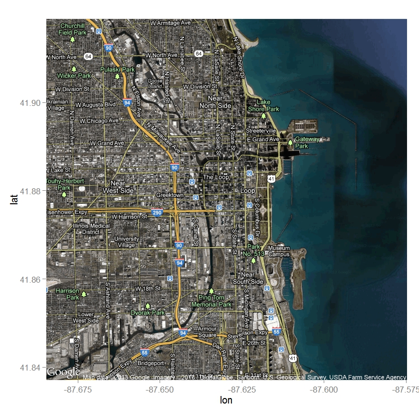
# get map with name
library(ggmap)
# example of map of Chicago
chicagomap = get_map(location = "Chicago", zoom = 13, maptype = "hybrid" , source = "google")
chicagomap = ggmap(chicagomap)
chicagomap