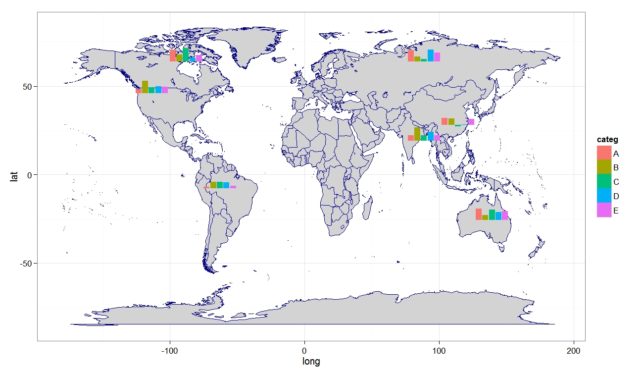
library("maps")
require(ggplot2)
library(ggsubplot)
world.map <- map("world", plot = FALSE, fill = TRUE)
world_map <- map_data("world")
require(lattice)
require(latticeExtra)
# Calculate the mean longitude and latitude per region (places where subplots are plotted)
library(plyr)
cntr <- ddply(world_map,.(region),summarize,long=mean(long),lat=mean(lat))
# example data
myd <- data.frame (region = c("USA","China","USSR","Brazil", "Australia","India", "Nepal", "Canada",
"South Africa", "South Korea", "Philippines", "Mexico", "Finland",
"Egypt", "Chile", "Greenland"),
frequency = c(501, 350, 233, 40, 350, 150, 180, 430, 233, 120, 96, 87, 340, 83, 99, 89))
subsetcntr <- subset(cntr, region %in% c("USA","China","USSR","Brazil", "Australia","India", "Nepal", "Canada",
"South Africa", "South Korea", "Philippines", "Mexico", "Finland",
"Egypt", "Chile", "Greenland"))
simdat <- merge(subsetcntr, myd)
colnames(simdat) <- c( "region","long","lat", "myvar" )
panel.3dmap <- function(..., rot.mat, distance, xlim,
ylim, zlim, xlim.scaled, ylim.scaled, zlim.scaled) {
scaled.val <- function(x, original, scaled) {
scaled[1] + (x - original[1]) * diff(scaled)/diff(original)
}
m <- ltransform3dto3d(rbind(scaled.val(world.map$x,
xlim, xlim.scaled), scaled.val(world.map$y, ylim,
ylim.scaled), zlim.scaled[1]), rot.mat, distance)
panel.lines(m[1, ], m[2, ], col = "green4")
}
p2 <- cloud(myvar ~ long + lat, simdat, panel.3d.cloud = function(...) {
panel.3dmap(...)
panel.3dscatter(...)
}, type = "h", col = "red", scales = list(draw = FALSE), zoom = 1.1,
xlim = world.map$range[1:2], ylim = world.map$range[3:4],
xlab = NULL, ylab = NULL, zlab = NULL, aspect = c(diff(world.map$range[3:4])/diff(world.map$range[1:2]),
0.3), panel.aspect = 0.75, lwd = 2, screen = list(z = 30,
x = -60), par.settings = list(axis.line = list(col = "transparent"),
box.3d = list(col = "transparent", alpha = 0)))
print(p2)
# Over US map
library("maps")
state.map <- map("state", plot = FALSE, fill = FALSE)
require(lattice)
require(latticeExtra)
# data
state.info <- data.frame(name = state.name, long = state.center$x,
lat = state.center$y)
set.seed(123)
state.info$yvar<- rnorm (nrow (state.info), 20, 5)
panel.3dmap <- function(..., rot.mat, distance, xlim,
ylim, zlim, xlim.scaled, ylim.scaled, zlim.scaled) {
scaled.val <- function(x, original, scaled) {
scaled[1] + (x - original[1]) * diff(scaled)/diff(original)
}
m <- ltransform3dto3d(rbind(scaled.val(state.map$x,
xlim, xlim.scaled), scaled.val(state.map$y, ylim,
ylim.scaled), zlim.scaled[1]), rot.mat, distance)
panel.lines(m[1, ], m[2, ], col = "grey40")
}
pl <- cloud(yvar ~ long + lat, state.info, subset = !(name %in%
c("Alaska", "Hawaii")), panel.3d.cloud = function(...) {
panel.3dmap(...)
panel.3dscatter(...)
}, col = "blue2", type = "h", scales = list(draw = FALSE), zoom = 1.1,
xlim = state.map$range[1:2], ylim = state.map$range[3:4],
xlab = NULL, ylab = NULL, zlab = NULL, aspect = c(diff(state.map$range[3:4])/diff(state.map$range[1:2]),
0.3), panel.aspect = 0.75, lwd = 2, screen = list(z = 30,
x = -60), par.settings = list(axis.line = list(col = "transparent"),
box.3d = list(col = "transparent", alpha = 0)))
print(pl)
The blog is a collection of script examples with example data and output plots. R produce excellent quality graphs for data analysis, science and business presentation, publications and other purposes. Self-help codes and examples are provided. Enjoy nice graphs !!

Labels
2d
(1)
3 vartiable plots
(5)
3D plots
(8)
arch
(1)
area
(1)
association plot
(4)
bar
(1)
barchart
(13)
bean plot
(1)
beeswarm
(1)
binormial
(1)
biplot
(1)
box-percentile
(2)
box-whisker plot
(1)
boxplot
(10)
bubble plot
(5)
calendar
(1)
categorical data
(6)
centepede plot
(1)
circle
(2)
circular
(1)
cluster
(4)
color
(2)
colour
(1)
combination plot
(10)
countur
(1)
cross bar
(1)
cumulative
(1)
curve
(3)
dendogram
(3)
density
(13)
diagram
(2)
distribution
(9)
ditribution
(1)
dot plot
(1)
double axis
(1)
ellipse
(2)
error bar
(6)
factor plot
(3)
fluctutation diagram
(1)
google
(1)
grid plot
(1)
heatmap
(20)
hexabin plot
(1)
histogram
(11)
hive
(1)
kernel density
(4)
ladder plot
(2)
large data points
(4)
level plot
(1)
line plot
(3)
line range
(1)
manhattan plot
(1)
map
(13)
mosaic plot
(1)
normal
(2)
notched
(1)
parallel plot
(1)
pedigree plot
(1)
phylogentic tree
(1)
piechart
(3)
points
(2)
polar
(1)
Q-Q plot
(1)
raster
(2)
regression line
(3)
ribbon plot
(1)
rootogram
(1)
rugs
(2)
scale plot
(1)
scenes
(1)
shaded
(1)
spatial plot
(2)
sphere
(1)
spike histogram
(1)
Spine plot
(1)
stacked bar
(1)
Sunflower
(1)
ternary plot
(1)
text only
(1)
timeseries
(6)
trellis plot
(8)
two axis
(1)
vinn diagram
(1)
voilin plot
(2)
wireframe plot
(1)
xy barplot
(4)
xy line
(10)
xy points
(25)
Showing posts with label map. Show all posts
Friday, May 3, 2013
RG#106: add satellite imagery, or open street maps to your plots using openmap package (bing, mapquest)
library(OpenStreetMap)
library(rgdal)
# get world map
map <- openmap(c(70,-179), c(-70,179))
plot(map)
bingmap <- openmap(c(70,-179), c(-70,179), type = "bing"
)plot(bingmap)
# types available
# type = c("osm", "osm-bw", "maptoolkit-topo", "waze", "mapquest", "mapquest-aerial", "bing", "stamen-toner", "stamen-terrain", "stamen-watercolor", "osm-german", "osm-wanderreitkarte", "mapbox", "esri", "esri-topo", "nps", "apple-iphoto", "skobbler", "cloudmade-<id>", "hillshade", "opencyclemap", "osm-transport", "osm-public-transport", "osm-bbike", "osm-bbike-german")
#zoom maps, plot a portion
#
upperLeft, lowerRight
lat <- c(
43.834526782236814, 30.334953881988564)
lon <- c(
-85.8857421875, -70.0888671875)
southest <- openmap(c(lat[1],lon[1]),c(lat[2],lon[2]),zoom=7,'osm')
plot(
southest)
library(UScensus2000tract)
data(south_carolina.tract)
lat <- c(
35.834526782236814, 30.334953881988564)
lon <- c(
-85.8857421875, -70.0888671875)
southest <- openmap(c(lat[1],lon[1]),c(lat[2],lon[2]),zoom=7,'osm')
south_carolina.tract <- spTransform(south_carolina.tract,osm())
plot(southest)
plot(south_carolina.tract,add=TRUE,col=(south_carolina.tract@data$med.age>35)+4)
plot(southest)
plot(south_carolina.tract,add=TRUE,col=(south_carolina.tract@data$med.age>55)+4)
Wednesday, May 1, 2013
RG#101: Plot country map with annotation of regions
## Load required packages
library(maptools)
library(raster)
# Download data from gadm.org using getData function
admNPL <- getData('GADM', country='NPL', level=3)
plot(admNPL, bg="lightgreen", axes=T)
##Plot
plot(admNPL, lwd=10, border="skyblue", add=T)
plot(admNPL,col="yellow", add=T)
grid()
box()
invisible(text(getSpPPolygonsLabptSlots(admNPL), labels=as.character(admNPL$NAME_3), cex=0.4, col="black", font=2))
mtext(side=3, line=1, "District Map of Nepal", cex=2)
mtext(side=1, "Longitude", line=2.5, cex=1.1)
mtext(side=2, "Latitude", line=2.5, cex=1.1)
RG#100: Trellis map plot with heatmap colors
require(maps)library(mapproj)worldmap <- map('world', plot = FALSE, fill = FALSE, projection = "azequalarea")country = worldmap$namesset.seed(1234)var.2010 = rnorm (length (country), 20, 10)var.2011 = var.2010*1.1 + rnorm (length (country), 0, 1)var.2012 = var.2011*0.98 + rnorm (length (country), 0, 4)var.2013 = var.2011*0.98 + rnorm (length (country), 0, 30)worldt <- data.frame (country, var.2010, var.2011, var.2012, var.2013)mapplot(country ~ var.2011, worldt, map = map("world", plot = FALSE, fill = TRUE))
mapplot(country ~ var.2010 + var.2011 + var.2012 + var.2013, data = worldt, map = map("world", plot = FALSE, fill = TRUE))
# trellis plot for country maps not available in maps package:
# get the map; may need sometime to be loaded
con <- url("http://gadm.org/data/rda/NPL_adm3.RData")
print(load(con))
close(con)
# from your data file working directory
## load ("NPL_adm3.RData")
# data
districts = gadm$NAME_3
set.seed(1234)
var1 <- rnorm (length (districts), 100, 30)
var2 <- rnorm (length (districts), 100, 30)
myd <- data.frame (districts, var1, var2)
# US county level map
uscountymap <- map('county', plot = FALSE, fill = FALSE, projection = "azequalarea")
county = uscountymap$namesset.seed(1234)
var.2010 = rnorm (length (county), 50, 10)
var.2011 = var.2010*1.1 + rnorm (length (county), 0, 5)
var.2012 = var.2011*0.98 + rnorm (length (county), 0, 10)
var.2013 = var.2011*1.2 + rnorm (length (county), 0, 15)
uscounty <- data.frame (county, var.2010, var.2011, var.2012, var.2013)
mapplot(county ~ var.2010 + var.2011 + var.2012 + var.2013, data = uscounty, map = map("county", plot = FALSE, fill = TRUE))
# US state level mapusstmap <- map('state', plot = FALSE, fill = FALSE, projection = "azequalarea")
state = usstmap$namesset.seed(1234)
var.2010 = rnorm (length (state), 50, 10)
var.2011 = var.2010*1.1 + rnorm (length (state), 0, 5)
var.2012 = var.2011*0.98 + rnorm (length (state), 0, 10)
var.2013 = var.2011*1.2 + rnorm (length (state), 0, 15)
usst <- data.frame (county, var.2010, var.2011, var.2012, var.2013)
mapplot(state ~ var.2010 + var.2011 + var.2012 + var.2013, data = usst, map = map("state", plot = FALSE, fill = TRUE), colramp = colorRampPalette(c("green", "purple")))
Thursday, April 25, 2013
RG#91: Plot bar or pie chart over world map using rworldmap package
require (rworldmap)
require(rworldxtra)
# get world map
require(rworldxtra)
# get world map
plot(getMap(resolution = "high" ))
##getting example data
dataf <- getMap()@data
mapBars( dataf, nameX="LON", nameY="LAT" , nameZs=c('GDP_MD_EST',
'GDP_MD_EST','GDP_MD_EST') , mapRegion='asia' , symbolSize=2 ,
barOrient = 'horiz' )
mapBars( dataf, nameX="LON", nameY="LAT" , nameZs=c('GDP_MD_EST','GDP_MD_EST',
'GDP_MD_EST') , mapRegion='asia' , symbolSize=3 , barOrient = 'vert' ,
oceanCol = "blue1", landCol = "lightgreen")
mapPies( dataf,nameX="LON", nameY="LAT", nameZs=c('GDP_MD_EST','GDP_MD_EST',
'GDP_MD_EST','GDP_MD_EST'),mapRegion='asia', oceanCol = "lightseagreen",
landCol = "gray50")
Wednesday, April 24, 2013
RG#88: Plot pie over google map
require(ggplot2)
library(ggmap)
require(grid)
# blank theme function
blk_theme <- function (){theme(
line = element_blank(),
rect = element_blank(),
text = element_blank(),
axis.ticks.length = unit(0, "cm"),
axis.ticks.margin = unit(0.01, "cm"),
legend.position = "none",
panel.margin = unit(0, "lines"),
plot.margin = unit(c(0, 0, -.5, -.5), "lines"),
complete = TRUE
)
}
dha = get_map(location = c(lon = 80.56410278, lat = 28.7089375), zoom = 14, maptype = 'roadmap', source = "google")
dhamp <- ggmap(dha) + blk_theme ()
# data 1
d1 <- sample ( c("A", "B", "C", "D"), 100, replace = TRUE)
d2 <- sample ( c("A", "B", "C"), 100, replace = TRUE)
d3 <- sample ( c("A", "B"), 100, replace = TRUE)
d4 <- sample ( c("A", "B"), 100, replace = TRUE)
d5 <- sample ( c("A", "B", "C", "D"), 100, replace = TRUE)
myd <- data.frame(x = factor(1),d1, d2, d3, d4, d5)
# pie charts
pie1 <- qplot(x, d1, data = myd, geom = 'bar', fill = d1) +
coord_polar(theta = 'y') + blk_theme()
pie2 <- qplot(x, d2, data = myd, geom = 'bar', fill = d2) +
coord_polar(theta = 'y') + blk_theme()
pie3 <- qplot(x, d3, data = myd, geom = 'bar', fill = d3) +
coord_polar(theta = 'y') + blk_theme()
pie4 <- qplot(x, d4, data = myd, geom = 'bar', fill = d4) +
coord_polar(theta = 'y') + blk_theme()
pie5 <- qplot(x, d5, data = myd, geom = 'bar', fill = d5) +
coord_polar(theta = 'y') + blk_theme()
# plotting and viewports
# function
vplayout <- function(x, y)viewport(layout.pos.row = x, layout.pos.col = y)
####
grid.newpage()
pushViewport(viewport(layout = grid.layout(20,20)))
# print mainmap
print(dhamp, vp = vplayout(1:20, 1:20))
# need to find manually, maximum and minimum lon and lat
# click on google earth to find
maximum.lon <- 80.591
minimum.lon <- 80.538
maximum.lat <- 28.735
minimum.lat <- 28.685
# X and Y cordinates where pie need to draw
pieposX <- c(28.72, 28.73, 28.70,28.73,28.69 )
pieposY <- c(80.55, 80.58, 80.58, 80.55,80.58)
ycoord <- 20 * ((pieposX - minimum.lat)/(maximum.lat - minimum.lat))
xcoord <- 20 * ((pieposY - minimum.lon)/(maximum.lon - minimum.lon))
# plot pie over layer
print(pie1, vp = vplayout(xcoord[1], ycoord[1]))
print(pie2, vp = vplayout(xcoord[2], ycoord[2]))
print(pie3, vp = vplayout(xcoord[3], ycoord[3]))
print(pie4, vp = vplayout(xcoord[4], ycoord[4]))
print(pie5, vp = vplayout(xcoord[5], ycoord[5]))
# bigger pie plot
grid.newpage()
pushViewport(viewport(layout = grid.layout(7,7)))
# print mainmap
print(dhamp, vp = vplayout(1:7, 1:7))
# need to find manually, maximum and minimum lon and lat
# click on google earth to find
maximum.lon <- 80.591
minimum.lon <- 80.538
maximum.lat <- 28.735
minimum.lat <- 28.685
# X and Y cordinates where pie need to draw
pieposX <- c(28.72, 28.73, 28.70,28.73,28.69 )
pieposY <- c(80.55, 80.58, 80.58, 80.55,80.58)
ycoord <- 7 * ((pieposX - minimum.lat)/(maximum.lat - minimum.lat))
xcoord <- 7 * ((pieposY - minimum.lon)/(maximum.lon - minimum.lon))
# plot pie over layer
print(pie1, vp = vplayout(xcoord[1], ycoord[1]))
print(pie2, vp = vplayout(xcoord[2], ycoord[2]))
print(pie3, vp = vplayout(xcoord[3], ycoord[3]))
print(pie4, vp = vplayout(xcoord[4], ycoord[4]))
print(pie5, vp = vplayout(xcoord[5], round (ycoord[5],0)))
RG#87: histogram / bar chart over map
library(ggsubplot)
library(ggplot2)
library(maps)
library(plyr)
#Get world map info
world_map <- map_data("world")
#Create a base plot
p <- ggplot() + geom_polygon(data=world_map,aes(x=long, y=lat,group=group), col = "blue4", fill = "lightgray") + theme_bw()
# Calculate the mean longitude and latitude per region (places where subplots are plotted),
cntr <- ddply(world_map,.(region),summarize,long=mean(long),lat=mean(lat))
# example data
myd <- data.frame (region = rep (c("USA","China","USSR","Brazil", "Australia","India", "Canada"),5),
categ = rep (c("A", "B", "C", "D", "E"),7), frequency = round (rnorm (35, 8000, 4000), 0))
subsetcntr <- subset(cntr, region %in% c("USA","China","USSR","Brazil", "Australia","India", "Canada"))
simdat <- merge(subsetcntr, myd)
colnames(simdat) <- c( "region","long","lat", "categ", "myvar" )
myplot <- p+geom_subplot2d(aes(long, lat, subplot = geom_bar(aes(x = categ, y = myvar, fill = categ, width=1), position = "identity")), ref = NULL, data = simdat)
print(myplot)
Monday, April 15, 2013
RG#65: Get google map and plot data in it
# get map
library(ggmap)
# example of map of Dhangadhi, Nepal
dhanmap1 = get_map(location = c(lon = 80.56410278, lat = 28.7089375), zoom = 12, maptype = 'roadmap', source = "google")
dhanmap1 = ggmap(dhanmap1)
dhanmap1
#zoomed map:
# example of map of Dhangadhi, Nepal
dhanmap2 = get_map(location = c(lon = 80.56410278, lat = 28.7089375), zoom = 14, maptype = 'roadmap', source = "google")
dhanmap2 = ggmap(dhanmap2)
dhanmap2
#zoomed map and satellite type
# example of map of Dhangadhi, Nepal
dhanmap3 = get_map(location = c(lon = 80.56410278, lat = 28.7089375), zoom = 18, maptype = "satellite", source = "google")
dhanmap3 = ggmap(dhanmap3)
dhanmap3
# plotting over map
dhanmap5 = get_map(location = c(lon = 80.56410278, lat = 28.7089375), zoom = 14, maptype = 'roadmap', source = "google")
dhanmap5 = ggmap(dhanmap5)
# data
set.seed(1234)
lon <- runif (40, 80.54, 80.59)
lat <- runif (40, 28.69, 28.73)
varA = rnorm (40, 20, 10)
myd <- data.frame (lon, lat, varA)
# the bubble chart
library(grid)
dhanmap5 + geom_point(aes(x = lon, y = lat, colour = varA, size = varA, alpha = 0.9), data = myd) + scale_colour_gradient(low="yellow", high="red")
# data
set.seed(1234)lon <- runif(50, 80.54, 80.59)lat <- runif(50, 28.69, 28.73 )varA = sample (c(1:5), 50, replace = TRUE)myd <- data.frame (lon, lat, varA)dhanmap5 + stat_bin2d(aes(x = lon, y = lat, colour = varA, fill = factor(varA)),
size = .10, alpha = 0.5, data = myd)
# get map with name
library(ggmap)
# example of map of Chicago
chicagomap = get_map(location = "Chicago", zoom = 13, maptype = "hybrid" , source = "google")
chicagomap = ggmap(chicagomap)
chicagomap
Sunday, April 14, 2013
RG#61: Plotting US or World Cities
require(maps)
map("world")
data(world.cities)
# cities with minimum 20,000 population
map.cities(world.cities, country = "", minpop = 20000,
maxpop = Inf,
pch = ".", col = "red")
map("world", col = "gray70", fill = TRUE)
data(world.cities)
# now device colors from yvar data category
# brewing color for continious color filling
library(RColorBrewer)
plotclr <- brewer.pal(7,"YlOrRd")#
# categorize in different class for yvar
world.cities$colrs <- as.numeric(cut(world.cities$pop, c(0, 250000, 500000, 750000, 1000000, 1250000, 1500000,Inf)))
# corresponding legend text
legdtxt <- c("<0.25M", "0.25-0.50M", "0.50-0.75M", "0.75-1M", "1-1.5M", ">1.5M")
world.cities$colrs <- as.numeric(cut(world.cities$pop, c(0, 250000, 500000, 750000, 1000000, 1250000, 1500000,Inf)))
# corresponding legend text
legdtxt <- c("<0.25M", "0.25-0.50M", "0.50-0.75M", "0.75-1M", "1-1.5M", ">1.5M")
map.cities(world.cities, country = "", minpop = 200000, maxpop = Inf, pch = 19, col = plotclr[world.cities$colrs])
legend("bottomleft", legdtxt, horiz = FALSE, fill = plotclr)
# world map cities pch proportional to population and color
map("world", col = "lightgreen", fill = TRUE)
data (world.cities)library(RColorBrewer)plotclr <- brewer.pal(7,"YlOrRd")## categorize in different class for yvar world.cities$colrs <- as.numeric(cut(world.cities$pop, c(0, 250000, 500000, 750000, 1000000, 1250000, 1500000,Inf)))
# corresponding legend text
legdtxt <- c("<0.25M", "0.25-0.50M", "0.50-0.75M", "0.75-1M", "1-1.5M", ">1.5M")
map.cities(world.cities, country = "", minpop = 100000, maxpop = Inf, pch = 19,
col = plotclr[world.cities$colrs], cex = world.cities$colrs *0.5)
legend("bottomleft", legdtxt, horiz = FALSE, fill = plotclr)
# same map in US
map('usa', fill = TRUE, col = "lightgreen")
data(us.cities)
library(RColorBrewer)
plotclr <- brewer.pal(6,"YlOrBr")## categorize in different class for yvar
us.cities$colrs <- as.numeric(cut(us.cities$pop, c(0, 50000, 500000, 750000, 1000000, Inf)))
# corresponding legend text
legdtxt <- c("<0.05M", "0.05-0.50M", "0.50-0.75M", "0.75-1M", ">1M")
map.cities(us.cities, country = "", minpop = 50000, maxpop = Inf, pch = 19,
col = plotclr[us.cities$colrs], cex = us.cities$colrs)
legend("bottomleft", legdtxt, horiz = FALSE, fill = plotclr, cex = 0.6)
RG#60: Plot world map and fill colors (heatmap)
require(maps)
# just random colors
worldmap <- map('world', fill = TRUE, col = rainbow (7))
# generating random variable to fill colors
set.seed(123)
filld <- data.frame (country.reg = worldmap$names, yvar = rnorm (length(worldmap$names), 50, 30))
# now device colors from yvar data category
# brewing color for continious color filling
library(RColorBrewer)
plotclr <- brewer.pal(6,"YlOrRd")#
library(RColorBrewer)
plotclr <- brewer.pal(6,"YlOrRd")#
# categorize in different class for yvar
filld$colorBuckets <- as.numeric(cut(filld$yvar, c(0, 30, 50, 70, 90, 130)))
# corresponding legend text
legdtxt <- c("<0%", "0-30%", "30-50%", "50-70%", "70-90%", ">90%")
map('world', fill = TRUE, col = plotclr )
legend("bottomleft", legdtxt, horiz = FALSE, fill = plotclr)
Saturday, April 13, 2013
RG#58:ploting heatmap in map using maps package (US map example)
library(maps)
#get a state boundry map
usmap <- map("state", plot = FALSE, fill = TRUE)
dataf <- data.frame (states = usmap$names, yvar = abs(rnorm(length(usmap$names), 50,22)))
# define colors
colors <- topo.colors (6)
# categorize in different class for yvar
dataf$colorBuckets <- as.numeric(cut(dataf$yvar, c(0, 30, 50, 70, 90, 130)))
# corresponding legend text
legdtxt <- c("<0%", "0-30%", "30-50%", "50-70%", "70-90%", ">90%")
# plot map
map("state", col = colors[dataf$colorBuckets], fill = TRUE, lty = 1, lwd = 0.2, projection="polyconic")
legend("topright", legdtxt, horiz = FALSE, fill = colors)
# county level example
# getting data
require(mapproj)
data(unemp)
data(county.fips)
# define color buckets
colors = heat.colors(6)
unemp$colorB <- as.numeric(cut(unemp$unemp, c(0, 2, 4, 6, 8, 10, 100)))
legdtext <- c("<2%", "2-4%", "4-6%", "6-8%", "8-10%", ">10%")
colorsmatched <- unemp$colorB [match(county.fips$fips, unemp$fips)]
# draw map
map("county", col = colors[colorsmatched], fill = TRUE, resolution = 0,
lty = 0, projection = "polyconic")
map("state", col = "white", fill = FALSE, add = TRUE, lty = 1, lwd = 0.2,
projection="polyconic")
title("US unemployment by county in year 2009")
legend("topright", legdtext, horiz = FALSE, fill = colors)
Subscribe to:
Posts (Atom)