Showing posts with label density. Show all posts

Thursday, May 2, 2013

RG#104: 2d density plots


require(ggplot2)

set.seed (1234)
Xv <- c(rnorm (500, 10,3), rnorm (500, 50, 20), rnorm (500, 70, 20))
Yv <- c(rnorm (500, 10,3), rnorm (500, 70, 5), rnorm (500, 30, 5))
myd <- data.frame (Xv, Yv )

m <- ggplot(myd, aes(x = Xv, y = Yv)) +
  geom_point() + geom_density2d() + theme_bw()
  
m


Sunday, April 28, 2013

RG#93: Add countour or heat map plot to XY scatter plot

# data
set.seed(1234)
n <- 10000
X = rnorm (n, 10, 4)
Y = X*1.5 + rnorm (n, 0, 8)


## colour brewing
library(RColorBrewer)
g = 11
my.cols <- rev(brewer.pal(g, "RdYlBu"))

#compute 2D kernel density

# kernel density using MASS 
library(MASS)
z <- kde2d(X, Y, n=50)

plot(X, Y, xlab="X", ylab="Y", pch=19, cex=.3, col = "gray60")
contour(z, drawlabels=FALSE, nlevels=g, col=my.cols, add=TRUE, lwd = 2)
abline(h=mean(Y), v=mean(X), lwd=2, col = "black")
legend("topleft", paste("r=", round(cor(X, Y),2)), bty="n")

## estimate the z counts
prob <- c(.99, .95, .90, .8, .5, .1, 0.05)
dx <- diff(z$x[1:2])
dy <- diff(z$y[1:2])
sz <- sort(z$z)

c1 <- cumsum(sz) * dx * dy

levels <- sapply(prob, function(x) {
              approx(c1, sz, xout = 1 - x)$y })

plot(X,Y, col = "gray80", pch = 19, cex = 0.3)
contour(z, levels= round (levels,7), add=T, col = "red")


# smooth scatter
require(KernSmooth)
smoothScatter(X, Y, nrpoints=.3*n, colramp=colorRampPalette(my.cols), pch=19, cex=.3, col = "green1")


Thursday, April 18, 2013

RG#80: Plotting boxplot and histogram (overlayed or in margin)

 # data
set.seed(4566)
data <- rnorm(100)


# layout where the boxplot is at top 
nf <- layout(mat = matrix(c(1,2),2,1, byrow=TRUE),  height = c(1,3))
par(mar=c(3.1, 3.1, 1.1, 2.1))
boxplot(data, horizontal=TRUE,  outline=TRUE,ylim=c(-4,4), frame=F, col = "green1")
hist(data,xlim=c(-4,4), col = "pink")


# layout boxplot is at the bottom 
nf <- layout(mat = matrix(c(1,2),2,1, byrow=TRUE),  height = c(3,1))
par(mar=c(3.1, 3.1, 1.1, 2.1))
hist(data,xlim=c(-4,4), col = "pink")
boxplot(data, horizontal=TRUE,  outline=TRUE,ylim=c(-4,4), frame=F, col = "green1", width = 10)


# Added to the  plot:
par(mar=c(3.1, 3.1, 1.1, 2.1))
hist(data,xlim=c(-4,4), col = "pink")
boxplot(data, horizontal=TRUE,  outline=TRUE,  ylim=c(-4,4), frame=F, col = "green1", add = TRUE)


Wednesday, April 17, 2013

RG#77: Histogram and Cumulative Histogram with overlayed density plot


## Make some sample data
x <- sample(0:30, 200, replace=T, prob=15 - abs(15 - 0:30))

## Calculate and plot the two histograms
hcum <- h <- hist(x, plot=FALSE)

hcum$counts <- cumsum(hcum$counts)
plot(hcum, main="")
plot(h, add=T, col="grey")

## Plot the density and cumulative density
d <- density(x)
lines(x = d$x, y = d$y * length(x) * diff(h$breaks)[1], lwd = 2)
lines(x = d$x, y = cumsum(d$y)/max(cumsum(d$y)) * length(x), lwd = 2)


Tuesday, April 16, 2013

RG#68: Quantile comparison plot - QQ Plot (normal, t or F)

set.seed(1234)
require(car)
xvar <- c(rnorm(100, 20, 5), rnorm (100, 30, 5))
# normal distribution 
qqPlot(xvar, dist="norm")


# t distribution with 20 df 

qqPlot(xvar, dist="t", df=20)


RG#67: Histogram with heatmap color in bars


# data 
set.seed(1234)
XV <- data.frame (x = rnorm(2000, 15, 4))


#plot 

plot1 <- ggplot(data = XV, aes(x = x, y = ..density..)) +
  geom_histogram(aes(fill = ..density..), binwidth = 0.25) +
  stat_density(geom = "path", size = 1, alpha = 0.5) +
  scale_y_continuous(expand = c(0.01, 0)) + scale_fill_gradient(low = "green4", high = "red") + xlab("Time") + ylab("Density") + theme_bw(16, "serif") +
  theme(legend.position = "none")

print(plot1)


Friday, April 12, 2013

RG#54: Scatter Diagram with Rugs, Spike Histogram, or Density


# data 
set(123)
x <- rnorm(1000, 50, 30)
y <- 3*x + rnorm(1000, 0, 20)
require(Hmisc)

plot(x,y)
#scat1d adds tick marks (bar codes. rug plot) 
# on any of the four sides of an existing plot, 
# corresponding with non-missing values of a vector x.
scat1d(x, col = "red")                 # density bars on top of graph
scat1d(y, 4, col = "blue")              # density bars at right

plot(x,y, pch = 19)
histSpike(x, add=TRUE, col = "green4", lwd = 2)       
histSpike(y, 4, add=TRUE,col = "blue", lwd = 2 )
histSpike(x, type='density',col = "red", add=TRUE)  # smooth density at bottom
histSpike(y, 4, type='density', col = "red", add=TRUE)
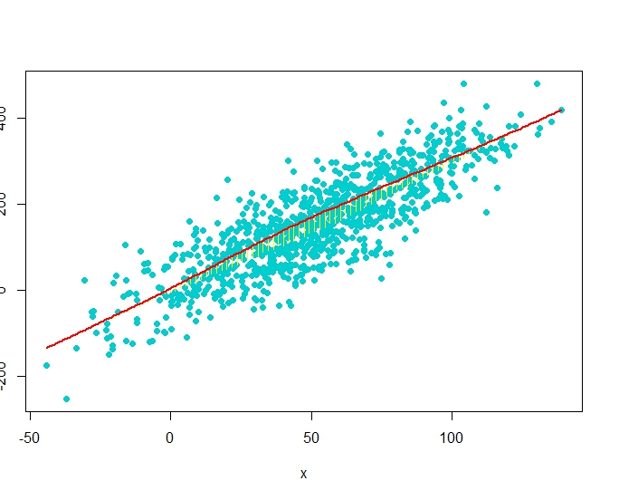
plot(x,y, pch = 19)
smooth <- lowess(x, y)    # add nonparametric regression curve
lines(smooth, col = "red")             # Note: plsmo() does this
scat1d(x, y=approx(smooth, xout=x)$y, col = "yellow") # data density on curve
scat1d(x, curve=smooth, col = "yellow")   # same effect as previous command


# data 
set(123)
x <- rnorm(1000, 50, 30)
y <- 3*x + rnorm(1000, 0, 60)
plot(x,y, pch = 19, col = "cyan3")
histSpike(x, curve=smooth, add=TRUE, col = "yellow") # same as previous but with histogram
histSpike(x, curve=smooth, type='density', col = "red",lwd=2, add=TRUE) 


Tuesday, April 9, 2013

RG#49 : Sunflower plot


# data
set.seed(1233) 
x <- round (runif(1500, 0, 40),0)
y <- round (runif (1500, 0, 100),0)


plot (x,y, pch = 21)
sunflowerplot(x,y, pch = 19, col = "gray80", cex = 1, cex.fact = 1, size = .08, seg.lwd = .8 ) 


RG#47: shaded normal curve

codx <- c(-3,seq(-3,-2,0.01),-2)
cody <- c(0,dnorm(seq(-3,-2,0.01)),0)

 curve(dnorm(x,0,1),xlim=c(-3,3),main='Standard Normal')
 polygon(codx,cody,col='red')


curve(dnorm(x,0,1),xlim=c(-3,3),main='Standard Normal')
polygon(codx,cody, density = c(10, 20),  angle = c(-45, 45))


# shading multiple polygons
 cord.x1 <- c(-3,seq(-3,-2,0.01),-2)
cord.y1 <- c(0,dnorm(seq(-3,-2,0.01)),0)

cord.x2 <- c(-2,seq(-2,-1,0.01),-1)
cord.y2 <- c(0,dnorm(seq(-2,-1,0.01)),0)

cord.x3 <- c(-1,seq(-1,0,0.01),0)
cord.y3 <- c(0,dnorm(seq(-1,0,0.01)),0)

cord.x4 <- c(0,seq(0,1,0.01),1)
cord.y4 <- c(0,dnorm(seq(0,1,0.01)),0)

cord.x5 <- c(1,seq(1,2,0.01),2)
cord.y5 <- c(0,dnorm(seq(1,2,0.01)),0)

cord.x6 <- c(2,seq(2,3,0.01),3)
cord.y6 <- c(0,dnorm(seq(2,3,0.01)),0)

curve(dnorm(x,0,1),xlim=c(-3,3),main='Standard Normal')

# brewing color for continious color filling
 library(RColorBrewer)
plotclr <- brewer.pal(6,"YlOrRd")#
 polygon(cord.x1,cord.y1,col= plotclr[1] , border = NA )
  polygon(cord.x2,cord.y2,col=plotclr[2], border = NA )
    polygon(cord.x3,cord.y3,col=plotclr[3], border = NA )
   polygon(cord.x4,cord.y4,col=plotclr[4], border = NA )
    polygon(cord.x5,cord.y5,col=plotclr[5], border = NA )
      polygon(cord.x6,cord.y6,col=plotclr[6], border = NA )
       curve(dnorm(x,0,1),xlim=c(-3,3),main='Standard Normal', col = "blue", lwd = 2, add = TRUE)


# totally shaded curve
x <- seq(from=-3, to=3,by=0.001)
gb_gradient <-colorRampPalette(c("blue", "lightgreen", "red"))
cols <- gb_gradient (length(x))
curve(dnorm(x,0,1), xlim=c(-3,3))
segments(x, rep(0,length(x)),x,dnorm(x,0,1) , col=cols, lwd=2)
curve(dnorm(x,0,1), xlim=c(-3,3), col = "red", lwd=2, add = TRUE)


Monday, April 8, 2013

RG#35: density or Kernel density plot

# data
set.seed(1234)
xvar <-  c(rnorm (200, 20, 5), rnorm (200, 50, 10))

# Kernel Density Plot
dnt <- density(xvar, main="Kernel Density of xvar")
plot(dnt, col = "red")


# density area plot
polygon(dnt, col="cyan4", border="red")


Friday, April 5, 2013

RG#11:multiple histograms with normal distribution or density curve overlayed

#data
set.seed(1233)

data1 < - data.frame(pop =c(rep("A x B", 200), rep("A x C", 200), rep("B x C", 200) ) , var1 = c(rnorm(1000, 90,10), rnorm(1000, 50, 10), rnorm(1000, 20, 30)))

#plot
require(lattice)


# plot overall distribution
histogram(~ var1, data= data1, nint = 12, xlab = "trait1(measuring unit)", type = "density", panel = function(x, ...) {
panel.histogram(x, ...)
panel.mathdensity(dmath = dnorm, col = "black",
args = list(mean=mean(x),sd=sd(x)))
} )


# plot by each group
histogram(~ var1|factor(pop), data= data1, nint = 10, xlab = "trait1(measuring unit)", type = "density",
panel = function(x, ...) {
panel.histogram(x, col = "darkgreen", ...)
panel.mathdensity(dmath = dnorm, col = "red",
args = list(mean=mean(x),sd=sd(x)))
} )


RG10 # plotting multiple suprimposed histograms or density plots

#data
set.seed(1233)

data1 <- data.frame(pop =c(rep("A x B", 200), rep("A x C", 200), rep("B x C", 200) ) ,   var1 =  c(rnorm(1000, 90,10), rnorm(1000, 50, 10), rnorm(1000, 20, 30)))
#
plot using ggplot2
require(ggplot2)
qplot( var1, data = data1, geom = "density" , group = pop, fill = pop, alpha=.3) + theme_bw( )

qplot( var1, data = data1, geom = "histogram" , group = pop, fill = pop, alpha=.3) + theme_bw( )


RG # 5: Grouped box plot


# data orage is from R library
data(Orange)

# to summarize the data
summary (Orange)
 Tree       age         circumference 
 3:7   Min.   : 118.0   Min.   : 30.0 
 1:7   1st Qu.: 484.0   1st Qu.: 65.5 
 5:7   Median :1004.0   Median :115.0 
 2:7   Mean   : 922.1   Mean   :115.9 
 4:7   3rd Qu.:1372.0   3rd Qu.:161.5 
       Max.   :1582.0   Max.   :214.0 

# defining own colors, for each group
mycol = c("darkcyan", "darkgreen", "brown4 ", "darkblue", "darkorchid4")
 boxplot(circumference ~ Tree,  data = Orange, main="Boxplot of circumference by tree ", col = mycol)