Showing posts with label histogram. Show all posts

Wednesday, April 24, 2013

RG#87: histogram / bar chart over map

library(ggsubplot)
library(ggplot2)
library(maps)
library(plyr)

#Get world map info
world_map <- map_data("world")

#Create a base plot
p <- ggplot()  + geom_polygon(data=world_map,aes(x=long, y=lat,group=group), col = "blue4", fill = "lightgray") + theme_bw()

# Calculate the mean longitude and latitude per region (places where subplots are plotted),
cntr <- ddply(world_map,.(region),summarize,long=mean(long),lat=mean(lat))

# example data
 myd <- data.frame (region = rep (c("USA","China","USSR","Brazil", "Australia","India", "Canada"),5),
                    categ = rep (c("A", "B", "C", "D", "E"),7), frequency = round (rnorm (35, 8000, 4000), 0))
                   

subsetcntr  <- subset(cntr, region %in% c("USA","China","USSR","Brazil", "Australia","India", "Canada"))

simdat <- merge(subsetcntr, myd)
colnames(simdat) <- c( "region","long","lat", "categ", "myvar" )


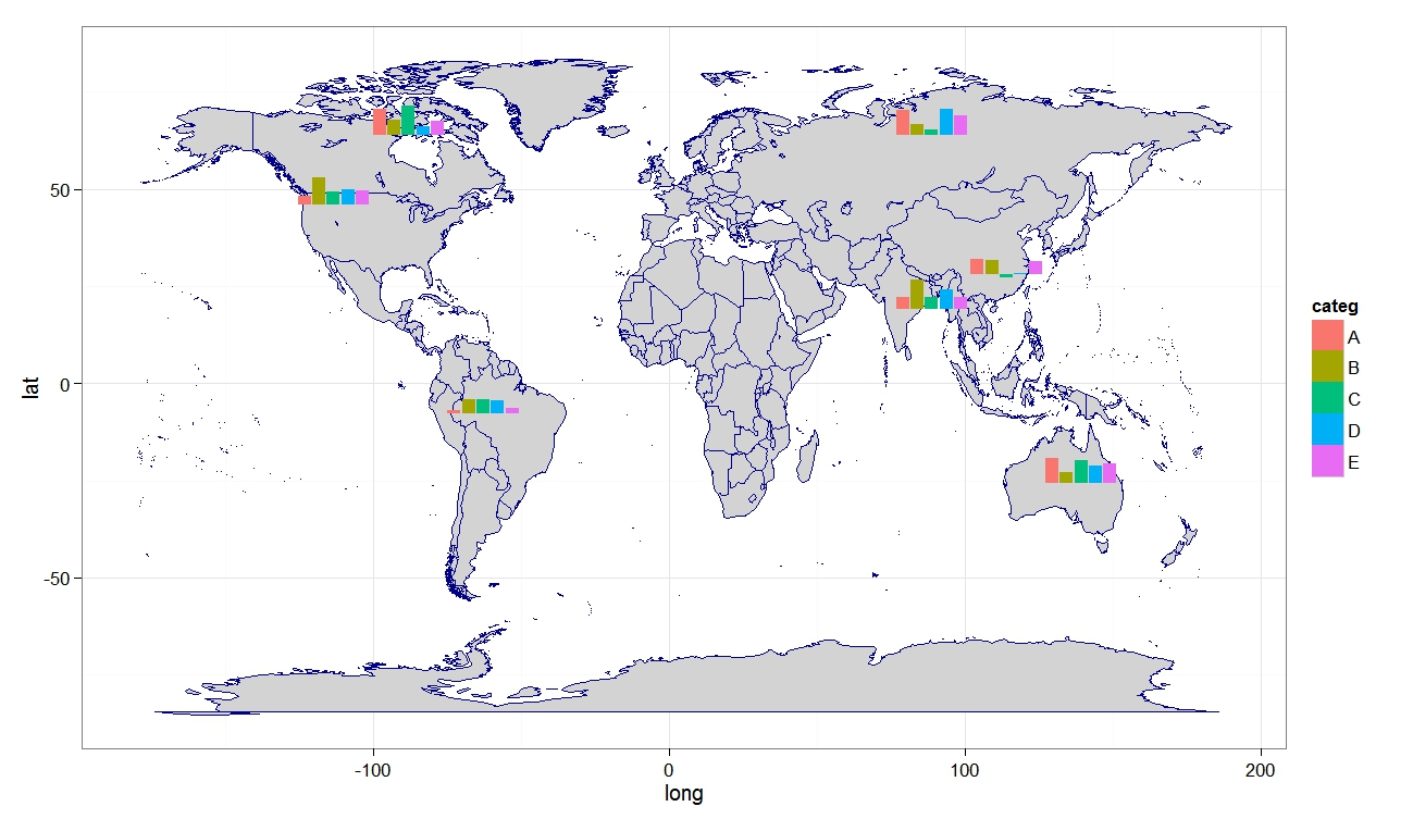
 myplot  <- p+geom_subplot2d(aes(long, lat, subplot = geom_bar(aes(x = categ, y = myvar, fill = categ, width=1), position = "identity")), ref = NULL, data = simdat)

print(myplot)


Thursday, April 18, 2013

RG#80: Plotting boxplot and histogram (overlayed or in margin)

 # data
set.seed(4566)
data <- rnorm(100)


# layout where the boxplot is at top 
nf <- layout(mat = matrix(c(1,2),2,1, byrow=TRUE),  height = c(1,3))
par(mar=c(3.1, 3.1, 1.1, 2.1))
boxplot(data, horizontal=TRUE,  outline=TRUE,ylim=c(-4,4), frame=F, col = "green1")
hist(data,xlim=c(-4,4), col = "pink")


# layout boxplot is at the bottom 
nf <- layout(mat = matrix(c(1,2),2,1, byrow=TRUE),  height = c(3,1))
par(mar=c(3.1, 3.1, 1.1, 2.1))
hist(data,xlim=c(-4,4), col = "pink")
boxplot(data, horizontal=TRUE,  outline=TRUE,ylim=c(-4,4), frame=F, col = "green1", width = 10)


# Added to the  plot:
par(mar=c(3.1, 3.1, 1.1, 2.1))
hist(data,xlim=c(-4,4), col = "pink")
boxplot(data, horizontal=TRUE,  outline=TRUE,  ylim=c(-4,4), frame=F, col = "green1", add = TRUE)


Wednesday, April 17, 2013

RG#77: Histogram and Cumulative Histogram with overlayed density plot


## Make some sample data
x <- sample(0:30, 200, replace=T, prob=15 - abs(15 - 0:30))

## Calculate and plot the two histograms
hcum <- h <- hist(x, plot=FALSE)

hcum$counts <- cumsum(hcum$counts)
plot(hcum, main="")
plot(h, add=T, col="grey")

## Plot the density and cumulative density
d <- density(x)
lines(x = d$x, y = d$y * length(x) * diff(h$breaks)[1], lwd = 2)
lines(x = d$x, y = cumsum(d$y)/max(cumsum(d$y)) * length(x), lwd = 2)


RG#71: Barplot (histogram) with heatmap strip at margin


require(grid)
require(ggplot2)

plt1<-ggplot(myd, aes(x=nam, y=Yv, fill = nam)) +   geom_bar(stat = "identity")  +
 theme(axis.title=element_blank()) + scale_fill_manual(values= c("green1", "green3", "green4", "blue1",
  "blue3", "purple", "tan", "gray50")) +  theme_bw()


 #tile plot for the x axis
px<-ggplot(myd,aes(x=nam,y=1,fill=Zv))+geom_bar(stat = "identity", width=1, col = "yellow") +
 scale_fill_gradient(low = "green4", high = "red") + scale_x_discrete(expand=c(0,0)) +  theme(
        axis.title=element_blank(),
        axis.text.x=element_blank(),
        axis.ticks.x=element_blank(),
        axis.text.y=element_text(color="white"),
        axis.ticks.y=element_line(color="white"))

#Define layout (2 rows, 1 columns)
lyt<-grid.layout(nrow=2,ncol=1,heights=c(7/8,1/8),widths=c(8),default.units=c('null','null'))

#View the layout of plots
#grid.show.layout(lyt)

#plots
grid.newpage()
pushViewport(viewport(layout=lyt))
print(plt1,vp=viewport(layout.pos.row=1,layout.pos.col=1))
print(px,vp=viewport(layout.pos.row=2,layout.pos.col=1))


Tuesday, April 16, 2013

RG#67: Histogram with heatmap color in bars


# data 
set.seed(1234)
XV <- data.frame (x = rnorm(2000, 15, 4))


#plot 

plot1 <- ggplot(data = XV, aes(x = x, y = ..density..)) +
  geom_histogram(aes(fill = ..density..), binwidth = 0.25) +
  stat_density(geom = "path", size = 1, alpha = 0.5) +
  scale_y_continuous(expand = c(0.01, 0)) + scale_fill_gradient(low = "green4", high = "red") + xlab("Time") + ylab("Density") + theme_bw(16, "serif") +
  theme(legend.position = "none")

print(plot1)


Friday, April 12, 2013

RG#54: Scatter Diagram with Rugs, Spike Histogram, or Density


# data 
set(123)
x <- rnorm(1000, 50, 30)
y <- 3*x + rnorm(1000, 0, 20)
require(Hmisc)

plot(x,y)
#scat1d adds tick marks (bar codes. rug plot) 
# on any of the four sides of an existing plot, 
# corresponding with non-missing values of a vector x.
scat1d(x, col = "red")                 # density bars on top of graph
scat1d(y, 4, col = "blue")              # density bars at right

plot(x,y, pch = 19)
histSpike(x, add=TRUE, col = "green4", lwd = 2)       
histSpike(y, 4, add=TRUE,col = "blue", lwd = 2 )
histSpike(x, type='density',col = "red", add=TRUE)  # smooth density at bottom
histSpike(y, 4, type='density', col = "red", add=TRUE)

plot(x,y, pch = 19)
smooth <- lowess(x, y)    # add nonparametric regression curve
lines(smooth, col = "red")             # Note: plsmo() does this
scat1d(x, y=approx(smooth, xout=x)$y, col = "yellow") # data density on curve
scat1d(x, curve=smooth, col = "yellow")   # same effect as previous command


# data 
set(123)
x <- rnorm(1000, 50, 30)
y <- 3*x + rnorm(1000, 0, 60)
plot(x,y, pch = 19, col = "cyan3")
histSpike(x, curve=smooth, add=TRUE, col = "yellow") # same as previous but with histogram
histSpike(x, curve=smooth, type='density', col = "red",lwd=2, add=TRUE) 


Monday, April 8, 2013

RG# 43: Histogram with colored tails


# data 
set.seed(1234)
 XV <- rnorm(2000, 15, 4)

# plotting 

 histgm <- hist(XV, breaks=100, plot=FALSE)

plot(histgm, col=ifelse(abs(histgm$breaks) < 10, "red", ifelse (abs(histgm$breaks) >20, "purple", "gray50")))


Friday, April 5, 2013

RG#13: Back to back histogram

#Back to back histograms
# data
set.seed(11233)

var1<- rnorm(1000,10,3)
var2 <- sample(c('A','B'),1000,TRUE)


#plot
 require(Hmisc)
 out <- histbackback(split(var1, var2), probability=TRUE, xlim=c(-.18,.18), main ='Back to Back Histogram')


RG#12: multiple histograms within a plot

# data
mycol <- c("green ", "blue ", "yellow ")
mydata<- list(rnorm(500, 10,5),rnorm(500, 10, 8),rnorm(500, 15,5) )


# using package plotrix
require(plotrix)
 multhist(mydata, col= mycol)


RG#11:multiple histograms with normal distribution or density curve overlayed

#data
set.seed(1233)

data1 < - data.frame(pop =c(rep("A x B", 200), rep("A x C", 200), rep("B x C", 200) ) , var1 = c(rnorm(1000, 90,10), rnorm(1000, 50, 10), rnorm(1000, 20, 30)))

#plot
require(lattice)


# plot overall distribution
histogram(~ var1, data= data1, nint = 12, xlab = "trait1(measuring unit)", type = "density", panel = function(x, ...) {
panel.histogram(x, ...)
panel.mathdensity(dmath = dnorm, col = "black",
args = list(mean=mean(x),sd=sd(x)))
} )


# plot by each group
histogram(~ var1|factor(pop), data= data1, nint = 10, xlab = "trait1(measuring unit)", type = "density",
panel = function(x, ...) {
panel.histogram(x, col = "darkgreen", ...)
panel.mathdensity(dmath = dnorm, col = "red",
args = list(mean=mean(x),sd=sd(x)))
} )


RG10 # plotting multiple suprimposed histograms or density plots

#data
set.seed(1233)

data1 <- data.frame(pop =c(rep("A x B", 200), rep("A x C", 200), rep("B x C", 200) ) ,   var1 =  c(rnorm(1000, 90,10), rnorm(1000, 50, 10), rnorm(1000, 20, 30)))
#
plot using ggplot2
require(ggplot2)
qplot( var1, data = data1, geom = "density" , group = pop, fill = pop, alpha=.3) + theme_bw( )

qplot( var1, data = data1, geom = "histogram" , group = pop, fill = pop, alpha=.3) + theme_bw( )