library("maps")
require(ggplot2)
library(ggsubplot)
world.map <- map("world", plot = FALSE, fill = TRUE)
world_map <- map_data("world")
require(lattice)
require(latticeExtra)
# Calculate the mean longitude and latitude per region (places where subplots are plotted)
library(plyr)
cntr <- ddply(world_map,.(region),summarize,long=mean(long),lat=mean(lat))
# example data
myd <- data.frame (region = c("USA","China","USSR","Brazil", "Australia","India", "Nepal", "Canada",
"South Africa", "South Korea", "Philippines", "Mexico", "Finland",
"Egypt", "Chile", "Greenland"),
frequency = c(501, 350, 233, 40, 350, 150, 180, 430, 233, 120, 96, 87, 340, 83, 99, 89))
subsetcntr <- subset(cntr, region %in% c("USA","China","USSR","Brazil", "Australia","India", "Nepal", "Canada",
"South Africa", "South Korea", "Philippines", "Mexico", "Finland",
"Egypt", "Chile", "Greenland"))
simdat <- merge(subsetcntr, myd)
colnames(simdat) <- c( "region","long","lat", "myvar" )
panel.3dmap <- function(..., rot.mat, distance, xlim,
ylim, zlim, xlim.scaled, ylim.scaled, zlim.scaled) {
scaled.val <- function(x, original, scaled) {
scaled[1] + (x - original[1]) * diff(scaled)/diff(original)
}
m <- ltransform3dto3d(rbind(scaled.val(world.map$x,
xlim, xlim.scaled), scaled.val(world.map$y, ylim,
ylim.scaled), zlim.scaled[1]), rot.mat, distance)
panel.lines(m[1, ], m[2, ], col = "green4")
}
p2 <- cloud(myvar ~ long + lat, simdat, panel.3d.cloud = function(...) {
panel.3dmap(...)
panel.3dscatter(...)
}, type = "h", col = "red", scales = list(draw = FALSE), zoom = 1.1,
xlim = world.map$range[1:2], ylim = world.map$range[3:4],
xlab = NULL, ylab = NULL, zlab = NULL, aspect = c(diff(world.map$range[3:4])/diff(world.map$range[1:2]),
0.3), panel.aspect = 0.75, lwd = 2, screen = list(z = 30,
x = -60), par.settings = list(axis.line = list(col = "transparent"),
box.3d = list(col = "transparent", alpha = 0)))
print(p2)
# Over US map
library("maps")
state.map <- map("state", plot = FALSE, fill = FALSE)
require(lattice)
require(latticeExtra)
# data
state.info <- data.frame(name = state.name, long = state.center$x,
lat = state.center$y)
set.seed(123)
state.info$yvar<- rnorm (nrow (state.info), 20, 5)
panel.3dmap <- function(..., rot.mat, distance, xlim,
ylim, zlim, xlim.scaled, ylim.scaled, zlim.scaled) {
scaled.val <- function(x, original, scaled) {
scaled[1] + (x - original[1]) * diff(scaled)/diff(original)
}
m <- ltransform3dto3d(rbind(scaled.val(state.map$x,
xlim, xlim.scaled), scaled.val(state.map$y, ylim,
ylim.scaled), zlim.scaled[1]), rot.mat, distance)
panel.lines(m[1, ], m[2, ], col = "grey40")
}
pl <- cloud(yvar ~ long + lat, state.info, subset = !(name %in%
c("Alaska", "Hawaii")), panel.3d.cloud = function(...) {
panel.3dmap(...)
panel.3dscatter(...)
}, col = "blue2", type = "h", scales = list(draw = FALSE), zoom = 1.1,
xlim = state.map$range[1:2], ylim = state.map$range[3:4],
xlab = NULL, ylab = NULL, zlab = NULL, aspect = c(diff(state.map$range[3:4])/diff(state.map$range[1:2]),
0.3), panel.aspect = 0.75, lwd = 2, screen = list(z = 30,
x = -60), par.settings = list(axis.line = list(col = "transparent"),
box.3d = list(col = "transparent", alpha = 0)))
print(pl)
The blog is a collection of script examples with example data and output plots. R produce excellent quality graphs for data analysis, science and business presentation, publications and other purposes. Self-help codes and examples are provided. Enjoy nice graphs !!
Labels
2d
(1)
3 vartiable plots
(5)
3D plots
(8)
arch
(1)
area
(1)
association plot
(4)
bar
(1)
barchart
(13)
bean plot
(1)
beeswarm
(1)
binormial
(1)
biplot
(1)
box-percentile
(2)
box-whisker plot
(1)
boxplot
(10)
bubble plot
(5)
calendar
(1)
categorical data
(6)
centepede plot
(1)
circle
(2)
circular
(1)
cluster
(4)
color
(2)
colour
(1)
combination plot
(10)
countur
(1)
cross bar
(1)
cumulative
(1)
curve
(3)
dendogram
(3)
density
(13)
diagram
(2)
distribution
(9)
ditribution
(1)
dot plot
(1)
double axis
(1)
ellipse
(2)
error bar
(6)
factor plot
(3)
fluctutation diagram
(1)
google
(1)
grid plot
(1)
heatmap
(20)
hexabin plot
(1)
histogram
(11)
hive
(1)
kernel density
(4)
ladder plot
(2)
large data points
(4)
level plot
(1)
line plot
(3)
line range
(1)
manhattan plot
(1)
map
(13)
mosaic plot
(1)
normal
(2)
notched
(1)
parallel plot
(1)
pedigree plot
(1)
phylogentic tree
(1)
piechart
(3)
points
(2)
polar
(1)
Q-Q plot
(1)
raster
(2)
regression line
(3)
ribbon plot
(1)
rootogram
(1)
rugs
(2)
scale plot
(1)
scenes
(1)
shaded
(1)
spatial plot
(2)
sphere
(1)
spike histogram
(1)
Spine plot
(1)
stacked bar
(1)
Sunflower
(1)
ternary plot
(1)
text only
(1)
timeseries
(6)
trellis plot
(8)
two axis
(1)
vinn diagram
(1)
voilin plot
(2)
wireframe plot
(1)
xy barplot
(4)
xy line
(10)
xy points
(25)
Showing posts with label barchart. Show all posts
Friday, May 3, 2013
Wednesday, May 1, 2013
RG#99: cloud 3D bars with heatmap
require(lattice)
require(latticeExtra)
data(VADeaths)
cloud(VADeaths, panel.3d.cloud = panel.3dbars,
xbase = 0.4, ybase = 0.4, zlim = c(0, max(VADeaths)),
scales = list(arrows = FALSE, just = "right"), xlab = NULL, ylab = NULL,
col.facet = level.colors(VADeaths, at = do.breaks(range(VADeaths), 20),
col.regions = cm.colors,
colors = TRUE),
colorkey = list(col = cm.colors, at = do.breaks(range(VADeaths), 20)),
screen = list(z = 40, x = -30))
Labels:
3 vartiable plots,
3D plots,
barchart,
heatmap
Thursday, April 25, 2013
RG#91: Plot bar or pie chart over world map using rworldmap package
require (rworldmap)
require(rworldxtra)
# get world map
require(rworldxtra)
# get world map
plot(getMap(resolution = "high" ))
##getting example data
dataf <- getMap()@data
mapBars( dataf, nameX="LON", nameY="LAT" , nameZs=c('GDP_MD_EST',
'GDP_MD_EST','GDP_MD_EST') , mapRegion='asia' , symbolSize=2 ,
barOrient = 'horiz' )
mapBars( dataf, nameX="LON", nameY="LAT" , nameZs=c('GDP_MD_EST','GDP_MD_EST',
'GDP_MD_EST') , mapRegion='asia' , symbolSize=3 , barOrient = 'vert' ,
oceanCol = "blue1", landCol = "lightgreen")
mapPies( dataf,nameX="LON", nameY="LAT", nameZs=c('GDP_MD_EST','GDP_MD_EST',
'GDP_MD_EST','GDP_MD_EST'),mapRegion='asia', oceanCol = "lightseagreen",
landCol = "gray50")
Wednesday, April 24, 2013
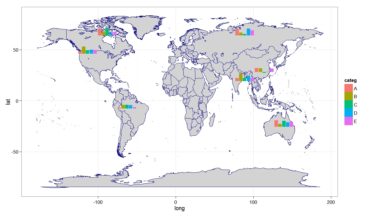
RG#87: histogram / bar chart over map
library(ggsubplot)
library(ggplot2)
library(maps)
library(plyr)
#Get world map info
world_map <- map_data("world")
#Create a base plot
p <- ggplot() + geom_polygon(data=world_map,aes(x=long, y=lat,group=group), col = "blue4", fill = "lightgray") + theme_bw()
# Calculate the mean longitude and latitude per region (places where subplots are plotted),
cntr <- ddply(world_map,.(region),summarize,long=mean(long),lat=mean(lat))
# example data
myd <- data.frame (region = rep (c("USA","China","USSR","Brazil", "Australia","India", "Canada"),5),
categ = rep (c("A", "B", "C", "D", "E"),7), frequency = round (rnorm (35, 8000, 4000), 0))
subsetcntr <- subset(cntr, region %in% c("USA","China","USSR","Brazil", "Australia","India", "Canada"))
simdat <- merge(subsetcntr, myd)
colnames(simdat) <- c( "region","long","lat", "categ", "myvar" )
myplot <- p+geom_subplot2d(aes(long, lat, subplot = geom_bar(aes(x = categ, y = myvar, fill = categ, width=1), position = "identity")), ref = NULL, data = simdat)
print(myplot)
library(ggplot2)
library(maps)
library(plyr)
#Get world map info
world_map <- map_data("world")
#Create a base plot
p <- ggplot() + geom_polygon(data=world_map,aes(x=long, y=lat,group=group), col = "blue4", fill = "lightgray") + theme_bw()
# Calculate the mean longitude and latitude per region (places where subplots are plotted),
cntr <- ddply(world_map,.(region),summarize,long=mean(long),lat=mean(lat))
# example data
myd <- data.frame (region = rep (c("USA","China","USSR","Brazil", "Australia","India", "Canada"),5),
categ = rep (c("A", "B", "C", "D", "E"),7), frequency = round (rnorm (35, 8000, 4000), 0))
subsetcntr <- subset(cntr, region %in% c("USA","China","USSR","Brazil", "Australia","India", "Canada"))
simdat <- merge(subsetcntr, myd)
colnames(simdat) <- c( "region","long","lat", "categ", "myvar" )
myplot <- p+geom_subplot2d(aes(long, lat, subplot = geom_bar(aes(x = categ, y = myvar, fill = categ, width=1), position = "identity")), ref = NULL, data = simdat)
print(myplot)
Tuesday, April 23, 2013
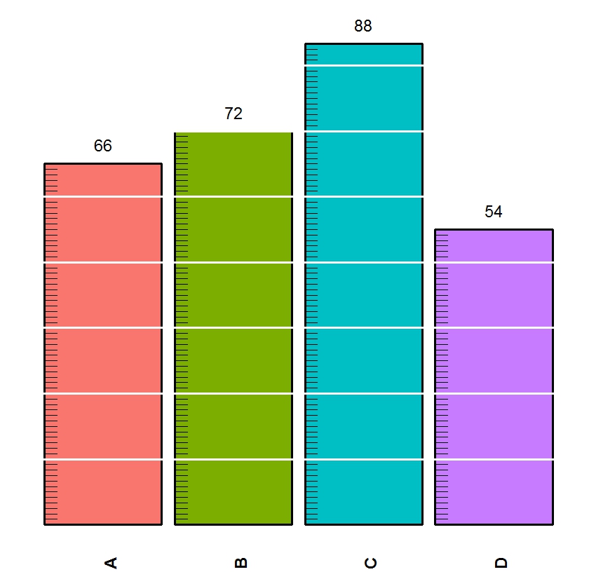
RG#84: Ruler plot (Scale plot)
require(ggplot2)
# function
ruler.bar.plot <-function(gg, nn, mjtick =1, mntick = 0.2, mjtickcol = "black", mntickcol = "white"){
seq.list<-list()
for(i in 1:length(gg)){
ystart<-seq(mntick ,gg[i],mntick )
yend<-ystart
xstart<-rep(i-0.45,length(ystart))
xend<-xstart+0.1
nam.val<-c(nn[i],rep(NA,length(ystart)-1))
numb.val<-c(gg[i],rep(NA,length(ystart)-1))
seq.list[[i]]<-data.frame(nam.val,numb.val,xstart,xend,ystart,yend)
}
df<-as.data.frame(do.call(rbind, seq.list))
p <- ggplot(df, aes(nam.val))
p + geom_bar(aes(y=numb.val,fill=nam.val),stat="identity",width=0.5,color=mjtickcol,lwd=1.1) +
geom_segment(aes(x=xstart,y=ystart,xend=xend,yend=yend), color=mjtickcol) +
ylim(c(0,max(gg)+0.5)) + scale_x_discrete(limits= nn) +
geom_hline(yintercept=seq(mjtick,max(gg),mjtick),color=mntickcol,lwd=1.1)+ geom_text(aes (y = numb.val, label = numb.val), vjust= - 1 ) +
guides(fill=FALSE) +
theme_bw()+
theme(axis.title=element_blank(),
axis.text.y=element_blank(),
axis.text.x=element_text(angle=90,face="bold",size=rel(1.5)),
axis.ticks=element_blank(),
panel.background = element_rect(fill = mntickcol),
panel.border=element_blank(),
panel.grid=element_blank(),
legend.position = "none")
}
# human height in inches, ticking done at each 12
htinch <- c(66, 72, 88, 54)
id <- c("A", "B", "C", "D")
ruler.bar.plot(htinch, id, mjtick =12, mntick = 1, mjtickcol = "black", mntickcol = "white")
ruler.bar.plot(htinch, id, mjtick =12, mntick = 2, mjtickcol = "red", mntickcol = "lightgoldenrodyellow")
VV = c(0.13, 0.33, 0.82, 0.46)
LV = c("A", "C", "L", "N")
ruler.bar.plot(VV, LV, mjtick =0.1, mntick = 0.02, mjtickcol = "black", mntickcol = "white")
# function
ruler.bar.plot <-function(gg, nn, mjtick =1, mntick = 0.2, mjtickcol = "black", mntickcol = "white"){
seq.list<-list()
for(i in 1:length(gg)){
ystart<-seq(mntick ,gg[i],mntick )
yend<-ystart
xstart<-rep(i-0.45,length(ystart))
xend<-xstart+0.1
nam.val<-c(nn[i],rep(NA,length(ystart)-1))
numb.val<-c(gg[i],rep(NA,length(ystart)-1))
seq.list[[i]]<-data.frame(nam.val,numb.val,xstart,xend,ystart,yend)
}
df<-as.data.frame(do.call(rbind, seq.list))
p <- ggplot(df, aes(nam.val))
p + geom_bar(aes(y=numb.val,fill=nam.val),stat="identity",width=0.5,color=mjtickcol,lwd=1.1) +
geom_segment(aes(x=xstart,y=ystart,xend=xend,yend=yend), color=mjtickcol) +
ylim(c(0,max(gg)+0.5)) + scale_x_discrete(limits= nn) +
geom_hline(yintercept=seq(mjtick,max(gg),mjtick),color=mntickcol,lwd=1.1)+ geom_text(aes (y = numb.val, label = numb.val), vjust= - 1 ) +
guides(fill=FALSE) +
theme_bw()+
theme(axis.title=element_blank(),
axis.text.y=element_blank(),
axis.text.x=element_text(angle=90,face="bold",size=rel(1.5)),
axis.ticks=element_blank(),
panel.background = element_rect(fill = mntickcol),
panel.border=element_blank(),
panel.grid=element_blank(),
legend.position = "none")
}
# human height in inches, ticking done at each 12
htinch <- c(66, 72, 88, 54)
id <- c("A", "B", "C", "D")
ruler.bar.plot(htinch, id, mjtick =12, mntick = 1, mjtickcol = "black", mntickcol = "white")
ruler.bar.plot(htinch, id, mjtick =12, mntick = 2, mjtickcol = "red", mntickcol = "lightgoldenrodyellow")
VV = c(0.13, 0.33, 0.82, 0.46)
LV = c("A", "C", "L", "N")
ruler.bar.plot(VV, LV, mjtick =0.1, mntick = 0.02, mjtickcol = "black", mntickcol = "white")
Wednesday, April 17, 2013
RG#76: Barplot with both X and Y quantitative value (width and height bar plot)
# data
dff <- data.frame(x = c("Aa", "Bbb", "Ccc", "Dddd", "Eeeee"),
xvr = c(35, 50, 15, 85, 100), yvr = c(100, 75, 50, 45, 25))
# reformat data
dff$w <- cumsum(dff$xvr)
dff$wm <- dff$w - dff$xvr
dff$wt <- with(dff, wm + (w - wm)/2)
library(ggplot2)
library(grid)
# plot
p <- ggplot(dff, aes(ymin = 0))
p1 <- p + geom_rect(aes(xmin = wm, xmax = w, ymax = yvr, colour = x, fill = x)) +
scale_colour_manual(values = c("green4", "lightseagreen", "pink", "blue3", "tan")) +
scale_fill_manual (values = c("green4", "lightseagreen", "pink", "blue3", "tan"))
p1 + geom_text(aes(x = wt, y = yvr * 0.8, label = x)) +
theme_bw() + labs(x = NULL, y = NULL) +
theme(axis.ticks = element_blank(),axis.text.x = element_blank(), axis.text.y = element_blank(), legend.position = "none") +
annotate("text", x = 120, y = 83, label = "Bbb") +
annotate("text", x = 270, y = 35, label = "Eeeee") +
geom_segment(aes(x = 100, y = 80, xend = 80, yend = 75),
arrow = arrow(length = unit(0.5, "cm"))) +
geom_segment(aes(x = 280, y = 32, xend = 250, yend = 25),
arrow = arrow(length = unit(0.5, "cm"))) + theme_bw()
RG#71: Barplot (histogram) with heatmap strip at margin
require(grid)
require(ggplot2)
plt1<-ggplot(myd, aes(x=nam, y=Yv, fill = nam)) + geom_bar(stat = "identity") +
theme(axis.title=element_blank()) + scale_fill_manual(values= c("green1", "green3", "green4", "blue1",
"blue3", "purple", "tan", "gray50")) + theme_bw()
#tile plot for the x axis
px<-ggplot(myd,aes(x=nam,y=1,fill=Zv))+geom_bar(stat = "identity", width=1, col = "yellow") +
scale_fill_gradient(low = "green4", high = "red") + scale_x_discrete(expand=c(0,0)) + theme(
axis.title=element_blank(),
axis.text.x=element_blank(),
axis.ticks.x=element_blank(),
axis.text.y=element_text(color="white"),
axis.ticks.y=element_line(color="white"))
#Define layout (2 rows, 1 columns)
lyt<-grid.layout(nrow=2,ncol=1,heights=c(7/8,1/8),widths=c(8),default.units=c('null','null'))
#View the layout of plots
#grid.show.layout(lyt)
#plots
grid.newpage()
pushViewport(viewport(layout=lyt))
print(plt1,vp=viewport(layout.pos.row=1,layout.pos.col=1))
print(px,vp=viewport(layout.pos.row=2,layout.pos.col=1))
Labels:
barchart,
combination plot,
heatmap,
histogram
Tuesday, April 16, 2013
RG#70: circular bar plot
library(ggplot2)
#DATA
catg <- c("A", "B", "C", "D", "F", "G")
percent <- c(88, 76, 72, 69, 59, 48)
category <- paste (catg, "-", percent, "%", sep = "")
myd <-data.frame(category,percent)
# converting to factor and applying to
#levels to set proper order of bars
myd$category <-factor(myd$category,levels=rev(myd$category))
# plot
plt <- ggplot(myd, aes(x = category, y = percent,fill = category)) + geom_bar(width = 0.85, stat="identity") + coord_polar(theta = "y") + xlab("") + ylab("") +
ylim(c(0,100)) + ggtitle("Graph 1") + geom_text(data = myd, hjust = 1, size = 3, aes(x = category, y = 0, label = category))
plt + scale_fill_manual(values = c("red1","red4", "green1", "green4", "blue1", "blue4")) + theme_minimal() + theme(legend.position = "none",panel.grid.major = element_blank(),panel.grid.minor = element_blank(), axis.line = element_blank(),axis.text.y = element_blank(), axis.text.x = element_blank(), axis.ticks = element_blank())
Monday, April 8, 2013
RG#38: Stacked bar chart (number and percent)
myd <- data.frame(
var1 = c(1,1,2,2,3,3,4,4),
samp = c("A","B","A","B","A","B","A","B"),
Value1 = c(3.5,2,5,8,3,2,7,2), Value2 = c(1.5,0,5,5,3,0,4,5) )
# rshaping data to long form for ggplot2
library(reshape2)
meltd<- melt(myd, id.vars=1:2)
#plot
library(ggplot2)
ggplot(meltd, aes(x=var1, y=value, fill=variable)) +
geom_bar(stat="identity") + facet_grid(~samp) + theme_bw()
# stacked percent
library (scales)
ggplot(meltd, aes(x=var1, y=value, fill=variable)) +
geom_bar(stat="identity", position = "fill") +
scale_y_continuous(labels = percent_format())+
facet_grid(~samp) + theme_bw()
samp = c("A","B","A","B","A","B","A","B"),
Value1 = c(3.5,2,5,8,3,2,7,2), Value2 = c(1.5,0,5,5,3,0,4,5) )
# rshaping data to long form for ggplot2
library(reshape2)
meltd<- melt(myd, id.vars=1:2)
#plot
library(ggplot2)
ggplot(meltd, aes(x=var1, y=value, fill=variable)) +
geom_bar(stat="identity") + facet_grid(~samp) + theme_bw()
# stacked percent
library (scales)
ggplot(meltd, aes(x=var1, y=value, fill=variable)) +
geom_bar(stat="identity", position = "fill") +
scale_y_continuous(labels = percent_format())+
facet_grid(~samp) + theme_bw()
Friday, April 5, 2013
RG#12: multiple histograms within a plot
RG#8: multiple arranged error bar plot (trallis type)
# multiple arranged error bar plot (trallis type)
#data
env <- c(rep("E1", 9), rep("E2", 9))
trt <- c(rep (c("A101", "B234", "c777"), each = 3))
group <- c(rep (1:3, 6))
yld <- c(3,4,6, 3,8,4, 1,2,6, 3,4,5, 6,7,7, 1,4,8)
se <- c(0.3, 0.6, 0.3, 0.6, 0.1, 0.9, 0.21, 0.4,
0.5, 0.2, 0.1, 0.3, 0.4, 0.2, 0.3, 0.4, 0.4, 0.3)
dataf <- data.frame (env, trt, group, yld, se)
limits <- aes(ymax = yld + se, ymin=yld - se)
# using ggplot2
require(ggplot2)
plt1 <- ggplot(dataf, aes(fill=factor(group), y=yld, x=trt))
plt1 + geom_bar(position= position_dodge(width=0.9)) +
geom_errorbar(limits, position= position_dodge(width=0.9), width=0.8) +
theme_bw( ) + facet_grid(.~env)
#data
env <- c(rep("E1", 9), rep("E2", 9))
trt <- c(rep (c("A101", "B234", "c777"), each = 3))
group <- c(rep (1:3, 6))
yld <- c(3,4,6, 3,8,4, 1,2,6, 3,4,5, 6,7,7, 1,4,8)
se <- c(0.3, 0.6, 0.3, 0.6, 0.1, 0.9, 0.21, 0.4,
0.5, 0.2, 0.1, 0.3, 0.4, 0.2, 0.3, 0.4, 0.4, 0.3)
dataf <- data.frame (env, trt, group, yld, se)
limits <- aes(ymax = yld + se, ymin=yld - se)
# using ggplot2
require(ggplot2)
plt1 <- ggplot(dataf, aes(fill=factor(group), y=yld, x=trt))
plt1 + geom_bar(position= position_dodge(width=0.9)) +
geom_errorbar(limits, position= position_dodge(width=0.9), width=0.8) +
theme_bw( ) + facet_grid(.~env)
RG#7: bar chart with error bar
# data
cmon<- c(600,250,150,135,350, 124)
cities <- c("A","B","C","D","E", "F")
error <- c(50, 33, 20, 15, 18, 12)
#plot
#using lattice plot package (often comes with base installation)
# using col pallette heat.colors so that we have different color for different bars
require(lattice)
barchart (cmon~ cities, col= heat.colors(5), ylab = "CM level (ppm)", xlab = " cities ")
#using ggplot2
require(ggplot2)
plt <- qplot(cities, cmon, geom="bar", fill = cities, ylab = " carbon mono oxide level(ppm) ", xlab = " cities ") + theme_bw( )
# adding error bars
plt + geom_errorbar(aes(ymin=cmon-error, ymax=cmon+error), width=.1, position=position_dodge(.1))
Subscribe to:
Posts (Atom)