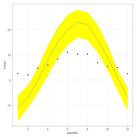
The following data consists of monthly average of temperature of a city. The data will be used to demonstrate how we can plot ribbon plot and combine with bar plot.
#data
months <- c(1:12)
High <- c(-6,-2,5,14,21,26,28,27,22,14,4,-3)
Low <- c(-16,-11,-5,2,9,14,17,16,11,4,-4,-12)
Mean <- c(-11,-7,0,8,15,20,23,22,16,9,1,-7)
Prepmm <- c(26.4 ,20.1 ,47.2 ,58.7 ,82.3 ,110.2 ,102.6 ,102.9 ,68.3 ,53.6 ,49.3 ,25.4 )
Prep <- Prepmm * 0.1 # converting to cm
minptemp <- data.frame(months, High, Low, Mean, Prep)
# plot
require(ggplot2) # need to install ggplot2
plt <- ggplot(minptemp, aes(x= months))
plt + geom_ribbon(aes(ymin= Low, ymax= High), fill="yellow") + geom_line(aes(y=Mean))+
geom_point(aes(x = months, y = Prep)) + theme_bw( ) # ribbon plus point plot months
Now it is turn to add bar plot:
#bar plot
plt + geom_ribbon(aes(ymin= Low, ymax= High), fill="yellow") + geom_line(aes(y=Mean,
col = "red")) + geom_bar(aes(y=Prep, x = months), stat="identity", colour="blue", fill = "tan") + theme_bw( ) # The better display barplot rainfall

